

About Selima Font
I ran into Selima Font while hunting for a loose, natural brush style for a quick poster series. I needed something bold, but not heavy or stiff. The titles had to feel casual, almost like quick notes from a sketchbook, and most script fonts I tried felt too polished.
This one caught my eye because of its rough edges and free-flowing strokes. I tested it on a music event poster first, then on a small social media set for Free Fonts Lab. I wanted to see if it could handle fast layouts, varied backgrounds, and still keep that easy, handmade energy.
Font Style & Design Analysis
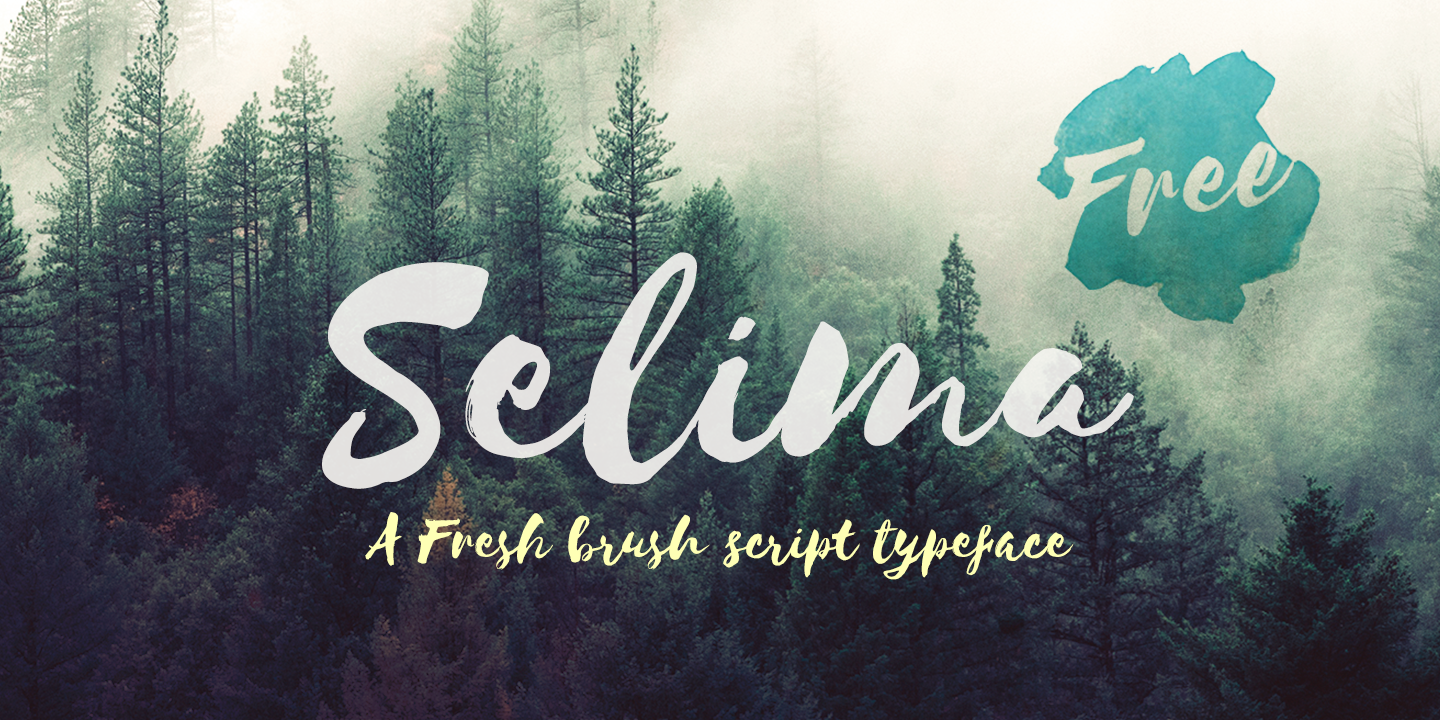
Selima Font is a pure brush typeface with a strong, hand-painted look. The strokes feel quick and confident, like a marker dragged across rough paper. You can see small breaks, ink pools, and irregular edges that give the font style a raw and human feel.
The designer of this font is unknown, at least from every source I could reliably check. That lack of clear credit is a bit of a shame, because there is obvious control in the rhythm of the letters. Nothing looks random, even though it pretends to be loose and spontaneous.
The letterforms are tall and slightly narrow, with strong contrast between thick and thin strokes. Spacing is quite tight by default, which works well for big headlines but can feel cramped in longer words. The brush texture brings a lively, informal mood, great for expressive typography. As a brush font family, it shines in short text and logos, but struggles when used in dense paragraphs or at very small sizes.
Where Can You Use Selima Font?
I find Selima Font most comfortable in display roles. It works well for poster titles, YouTube thumbnails, book covers, and bold social media graphics. When used big, the brush texture comes alive and adds personality without much extra design work. It can quickly set the tone for creative, relaxed brands.
For logos and wordmarks, it suits lifestyle labels, streetwear, handmade goods, and personal brands that want an approachable feel. I usually pair it with a clean sans-serif or light serif for body text, so the brush title can lead the visual identity. The contrast between rough and clean makes layouts feel balanced.
At smaller sizes, the rough edges start to blend, and the details become less readable. I avoid using it for long captions, UI text, or anything that needs fast scanning. It performs best in short phrases, tags, or callouts. When you let it breathe, the energy of the strokes supports the message instead of fighting it.
Font License
The licence terms for Selima Font can change between sources, and I never assume they are the same everywhere. Before using it in commercial work, always read the current licence from the original distributor. For personal experiments, tests, or mock-ups, I still make a habit of checking the official notes.
My honest take as a designer: I reach for this font when I need quick, expressive brush energy without overthinking it. It is not a tool for every project, but in the right place, it adds just enough roughness to make the design feel human.


Leave a Reply