
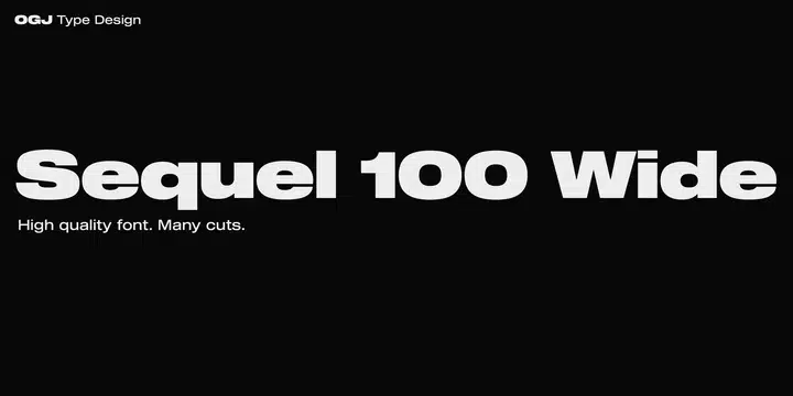

About Sequel 100 Font
I first reached for Sequel 100 Font while working on a clean tech brand that needed a calm, modern voice. The logo concept felt right, but the type still looked a bit cold and generic. I wanted something rational and strong, but not harsh or shouty.
During my tests for Free Fonts Lab, this font stood out because it balances clarity and personality very well. It looked confident without trying too hard. That mix made me curious enough to run it through real layouts, from logos to interface mockups, to see how much range I could get from one typeface.
Font Style & Design Analysis
This is a sans-serif typeface with a very controlled and measured look. The shapes feel geometric at first, but there are enough subtle curves to keep it from looking too stiff. Strokes are even and steady, which gives the font family a clear, system-like character that suits modern digital products.
The designer information is not clearly stated in the sources I checked, so I will note the designer unknown here. That said, the design logic feels considered and professional. The spacing, weight steps, and overall structure suggest it was drawn with long-term branding and interface work in mind, not just quick display use.
The letterforms have tight control: straight spines, open counters, and modest contrast. The rhythm feels even, so long words stay readable and never feel cramped. Kerning is steady, especially in caps, which helps in logos and headings. In smaller sizes, the regular weight holds up well, though ultra-light weights feel better in larger display roles. Its main strength is clean, neutral typography; its limitation is that it will not suit very playful or expressive projects on its own.
Where Can You Use Sequel 100 Font?
I see Sequel 100 Font working best in brand systems that need a modern but mature tone. Tech, finance, education, and architecture brands can use its calm voice for logos, wordmarks, and taglines. In decks and reports, the balanced sans-serif style keeps slides clear without drawing attention away from charts and content.
In large sizes, this sans-serif font style shines in headlines, hero text, and navigation labels. The clean letterforms keep edges sharp on screens, which suits UI design and dashboards. For smaller body text, I find the regular and medium weights easiest to read; they hold structure without looking heavy or dark, especially in longer paragraphs.
For pairings, I like matching this typeface with a warm serif for editorial layouts, or a soft script accent for personal brands. Within the same font family, using bold for headings and regular for body creates a tidy hierarchy. Just give it enough white space in your layout, and the typography feels airy and controlled, not crowded.
Font License
The licence for Sequel 100 Font can differ between personal and commercial use, depending on the source you choose. Do not assume it is free for client projects. Always read the official licence details carefully and confirm usage rights before you install it in a brand system or publish paid work.
After testing it in real projects, I see Sequel 100 as a steady, reliable choice when I need quiet strength in my typography.


Leave a Reply