
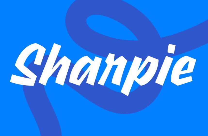

About Sharpie Font
I first tried Sharpie Font while working on a set of bold quote graphics for social media. I needed a loud, hand-drawn voice that still felt simple and easy to read. The name suggested a marker look, and the rough energy of this Sharpie Writing Font matched the mood I had in mind.
What kept me interested was how direct and casual it felt. The strokes look quick, almost like notes written in a rush, yet the letters stay clear. I tested it further for a few mock posters for Free Fonts Lab, just to see how far I could push it in different layouts and colour schemes.
Font Style & Design Analysis
Sharpie Font is a bold display typeface with a strong, marker-style voice. Each letter feels like it was drawn with a thick felt-tip pen, leaving dark, chunky strokes. The shapes lean more blocky than smooth, which gives the font a punchy, street-style presence that stands out in large titles and loud headlines.
The designer is unknown, so I approached it with a neutral mindset and focused only on the visual quality. I checked how the font behaved across different weights, but it appears to be a single, strong style. That single-style approach actually supports its role as a focused display font for quick impact rather than flexible branding systems.
The letterforms sit quite tight, with short counters and compact shapes that create a dense, solid texture. This tight spacing helps create strong blocks of text for headlines, but it can feel heavy in long lines. The rhythm feels jumpy and energetic, perfect for short phrases. Its main strength lies in short, attention-grabbing words; it struggles with long paragraphs, detailed body copy, or delicate typography where subtlety matters.
Where Can You Use Sharpie Font?
I find Sharpie Font works best in large sizes where its marker-style curves can breathe. Think posters, bold banners, t-shirt slogans, or cover graphics. When the letters are big, their rough charm reads clearly, and the slight irregularities feel intentional and human, not clumsy or messy.
On smaller text, the heavy strokes close up, and the counters lose clarity, so I avoid using it for captions or long copy. I usually pair it with a clean sans-serif font family for body text to balance the noise. The mix of loud headline and calm supporting text creates a clear hierarchy that feels controlled, not chaotic.
This Sharpie Writing Font suits youth brands, streetwear, DIY event posters, and social media graphics aimed at a casual, energetic audience. It can also work for quick labels, stickers, and hand-made themed projects. I would not use it for formal branding, corporate identities, or projects that need a refined, quiet voice, but for expressive, in-your-face layouts, it does its job well.
Font License
The licence for Sharpie Font can change depending on where you download it, so I never assume it is free for all use. Always read the official licence details for personal and commercial projects, and check for any attribution, usage limits, or embedding rules before you ship client work. As Ayan Farabi, I treat it as a fun, focused tool, best used with care and clear intent.


Leave a Reply