

About Shorelines Font
I first reached for Shorelines Font while working on a relaxed beach café brand. The client wanted something loose and friendly, but not childish or messy. I needed a script that felt hand-drawn, yet still readable in a logo and on simple packaging.
As I tested different options for Free Fonts Lab, this typeface stood out for its easy, flowing line and casual charm. It gave the wordmark a warm, human tone without looking forced. That balance between style and clarity made me curious to push it further and try it in real layouts, not just as a quick mock-up.
Font Style & Design Analysis
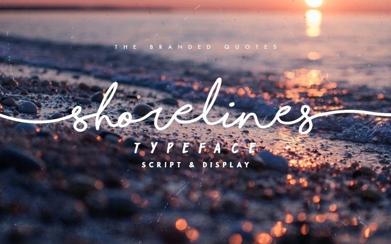
Shorelines Font is a script typeface with a relaxed, handwritten look. The strokes feel like they came from a quick brush pen, with gentle curves and soft loops. The baseline is slightly playful, so words do not sit perfectly straight, but the movement stays controlled rather than wild.
The designer is unknown, at least from what I could confirm through normal research. That does not affect how it behaves in design, but it does mean I treat it with extra care when checking licensing and source. I would rather be safe than sorry, especially for client work with bigger print runs.
The letterforms have a mix of smooth joins and small breaks that give a natural, handwritten rhythm. Spacing is on the loose side, so words feel airy and light. This script font shines in short phrases, names, and headings where its mood can breathe. It is less strong for dense body text or long paragraphs, where the flowing strokes can feel tiring to read.
Where Can You Use Shorelines Font?
I find Shorelines Font works best in branding for cafés, lifestyle products, and relaxed travel themes. It brings an easy-going tone that suits beachwear, handmade goods, and small creative businesses. On posters or social graphics, it holds up well at large sizes and keeps its casual, handwritten charm.
At smaller sizes, the script details start to blur, especially in longer words or tight lines. I usually keep it for headlines, logos, and short taglines, then pair it with a clean sans-serif font family for body text. This mix keeps the layout readable while still giving the visual identity a friendly, human voice.
For invitations, quotes, and packaging labels, the script style feels personal without being overly decorative. Just be careful with all-uppercase settings; this typeface looks more natural in title case or sentence case. When used with enough white space and a simple supporting typeface, Shorelines Font can give a design a soft, approachable character.
Font License
Before using Shorelines Font for personal or commercial projects, you should always check the licence from the original source. Terms can change, and some uses may need a paid or special licence. I always confirm rights first, especially for logos, packaging, or client work. My simple rule: no guesswork with licences.
For me as Ayan Farabi, this font is a nice tool when I want a gentle, handwritten script that feels relaxed yet still readable, as long as I use it in the right context.


Leave a Reply