

About Sketsa Ramadhan Font
I first picked up Sketsa Ramadhan Font while working on a calm, faith-inspired social media series for a client. I needed a handwritten look that felt warm, festive, and a bit playful, but not messy or hard to read. This brush style caught my eye because it carried a relaxed mood without losing structure.
I decided to test it across posts, story covers, and a simple poster for Free Fonts Lab. The font gave the layouts a welcoming touch, with strokes that felt drawn by hand, yet still controlled. It looked especially fitting for content around reflection, celebration, and night-time scenes.
Font Style & Design Analysis
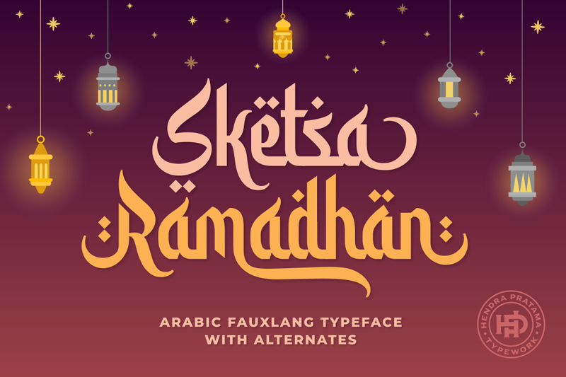
This is a pure brush typeface, and that sets the whole visual tone. Each stroke has a soft, marker-like texture, as if written quickly but with care. The letters lean slightly and flow together, giving the font style a natural rhythm that suits seasonal or spiritual themes.
The designer is unknown, which sometimes makes it harder to read the original creative intent. Still, from my testing, it feels like someone tried to capture casual handwritten lettering seen on posters during festive nights. The choices in stroke weight and curve shapes suggest a focus on friendly display work rather than strict readability at tiny sizes.
The letterforms have open counters and a moderate stroke contrast, so they stay readable at medium sizes. Spacing is on the tighter side, which helps headlines feel compact and energetic. The rhythm feels bouncy, with curves on letters like a, h, and n giving a gentle wave across a word. This brush font shines in short phrases and titles, but it starts to feel heavy and busy in long paragraphs or dense body text.
Where Can You Use Sketsa Ramadhan Font?
I find Sketsa Ramadhan Font works best in display roles: posters, social media banners, greeting cards, and themed quotes. At large sizes, the brush texture and curves become clear and add charm. It suits audiences looking for a personal, warm, and spiritual mood, especially around festive or reflective seasons.
In medium sizes, such as subtitles, story covers, or product labels, it still reads fine if you give it enough spacing. I like pairing this font family with a clean sans-serif for body copy, so the headline carries emotion while the supporting text stays quiet and simple. Strong contrast between the two font styles keeps layouts balanced.
For very small text, the strokes start to merge, and the texture loses impact. I avoid using it for long paragraphs, app interfaces, or serious corporate documents. Instead, I treat Sketsa Ramadhan Font as a character font for key words, logos for seasonal campaigns, or short taglines in branding where a handwritten touch feels right.
Font License
The licence for Sketsa Ramadhan Font can change depending on where you download it from. Do not assume it is free for commercial work, even if it appears in free sections. Always read the current licence terms on the original source and confirm usage rights before using it in client or paid projects. My own use stays careful and checked.
For me as Ayan Farabi, this font is a nice tool when I need a gentle, festive brush voice, as long as I keep it for short, focused text.


Leave a Reply