

About Skynyrd Font
I came across the Skynyrd Font while I was searching for a bold retro title style for a poster series. I needed something loud, but not messy. When I saw its heavy shapes and sharp edges, I felt it could carry strong words without getting lost in effects.
I decided to test it on a music event layout and a T-shirt mockup for a personal project I was refining for Free Fonts Lab. I wanted to see how the font behaved with texture, colour overlays, and tight grids. The reaction was instant: it delivered clear impact and a strong sense of attitude.
Font Style & Design Analysis
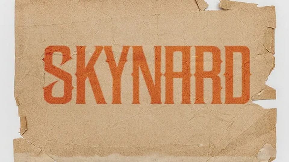
The Skynyrd Font is a pure display typeface, and it shows that from the first word you set. The letters feel heavy, angular, and proud. It has a strong retro rock flavour, with chunky forms that look ready for album covers, old tour posters, or bold headline art.
The creator of this font is designer unknown, which means there is no clear story from a named foundry or individual. That said, the design choices feel deliberate. The shapes suggest inspiration from classic rock branding and vintage signage, with a modern digital polish on top.
The letterforms are wide and compressed at the same time, with thick strokes and sharp internal corners. Spacing sits on the tighter side, so words form solid blocks of colour. This gives the font a strong rhythm, but it can feel dense in long phrases. As a display font family, it works best in short headlines, logos, badges, and wordmarks. It struggles in body text, small captions, or interfaces where legibility must be calm and quiet.
Where Can You Use Skynyrd Font?
I see the Skynyrd Font working very well for music-related projects, especially rock, metal, or Southern-inspired themes. It suits gig posters, album titles, stage backdrops, and festival branding. At large sizes, the heavy shapes and bold typography feel confident and punchy, without needing extra graphic noise.
On merchandise, this typeface can anchor T-shirt designs, patches, stickers, and badges. I tested it on a dark T-shirt mockup with off-white text, and the visual identity felt strong and clear. It can also work for bar signage, biker club graphics, or vintage-style logos when paired with a calmer sans-serif or serif for supporting text.
At smaller sizes, the font starts to lose clarity, especially in long words. For menus, websites, or flyers with lots of copy, I would only use Skynyrd Font for section titles or key callouts. I often pair heavy display fonts like this with a simple sans-serif for paragraphs. That balance keeps the layout readable while still keeping the bold attitude where it matters.
Font License
The licence for the Skynyrd Font can vary depending on where you download it from. Some sources may allow free personal use only, while commercial projects might need a paid licence or special terms. I always recommend checking the official licence details carefully before using it in client work or selling products.
My honest takeaway as Ayan Farabi: Skynyrd Font is a strong tool for bold, character-driven headlines, as long as you respect its limits in small sizes and keep it for the moments where you truly need impact.


Leave a Reply