

About Slayer Font
I first reached for Slayer Font while building a loud poster for a local metal gig. I needed a typeface that felt sharp, heavy, and a bit dangerous, but still readable from a distance. This font caught my eye because its energy matched the music and the rough visual style.
I decided to test it more deeply for Free Fonts Lab, as I wanted to see where it holds up and where it breaks. During layout work, I tried it in different colours, textures, and backgrounds. That helped me understand how this font family behaves in real projects, not just in mock-ups.
Font Style & Design Analysis
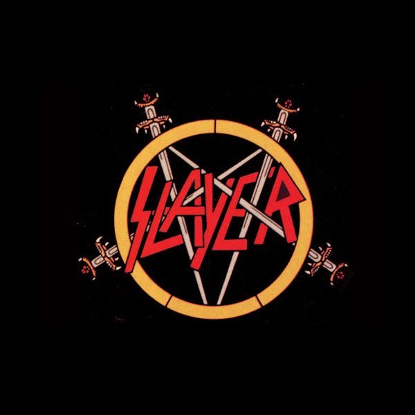
Slayer Font is a bold display typeface built for impact, not subtlety. It pushes hard with sharp angles, heavy strokes, and strong contrast. The shapes feel aggressive and tense, almost like cut metal or slashed lettering. It clearly aims for a loud, dramatic typography style that grabs attention right away.
The exact creator is not clearly credited anywhere I checked, so I would mark the designer as unknown. That said, the influence of classic metal band logos and horror posters is very clear. It feels like someone studied that visual identity closely and distilled it into a usable font style for modern layouts.
The letterforms have tight spacing and a compact rhythm, which adds pressure and density to every word. Sharp terminals and angled lines give it a hostile, almost chaotic mood. It shines in short headlines, logos, and title cards. Longer text blocks quickly become tiring. As a display font, it has strong personality but limited flexibility, so it must be handled with care.
Where Can You Use Slayer Font?
Slayer Font works best where you need raw energy and edge. Think music posters, band logos, horror titles, game covers, or streaming thumbnails. In big sizes, the details and spikes feel bold and deliberate. It instantly sets a dark, heavy tone that suits young and alternative audiences.
At medium sizes, like on flyers or merch tags, it can still work if you keep words short and layouts clean. I would avoid small body text with this typeface, as the sharp forms start to blur and reduce legibility. For layout balance, I often pair it with a simple sans-serif or neutral serif for supporting copy.
In branding, I see it fitting niche projects: metal bands, horror events, extreme sports, or edgy clothing lines. It can carry a strong visual identity when used as the main wordmark or headline style. But it is not a flexible all-rounder. You need a clear concept and a calm secondary font family to let Slayer Font do its loud job without overwhelming everything.
Font License
The licence terms for Slayer Font can vary depending on where you download it. Some versions may allow only personal use, while others may permit commercial projects. I always recommend checking the current licence on the official source before using it for client work or paid products.
For me, Slayer Font is a powerful tool when a project calls for something brutal and loud. I use it rarely, but when I do, it changes the whole mood of the design in a single line.


Leave a Reply