

About Slight Font
I came across Slight Font while working on a small packaging concept for a handmade soap brand. The client wanted something soft, flowing, and readable, without feeling overly fancy or dated. I needed a script that felt friendly and modern, but still human and a bit playful.
As I tested options for that job, Slight Font stood out because of its smooth curves and easy rhythm. It felt like quick, confident handwriting, not stiff calligraphy. I decided to try it in logos, labels, and short headlines, then later wrote down my notes for Free Fonts Lab so other designers could judge if it fits their work.
Font Style & Design Analysis
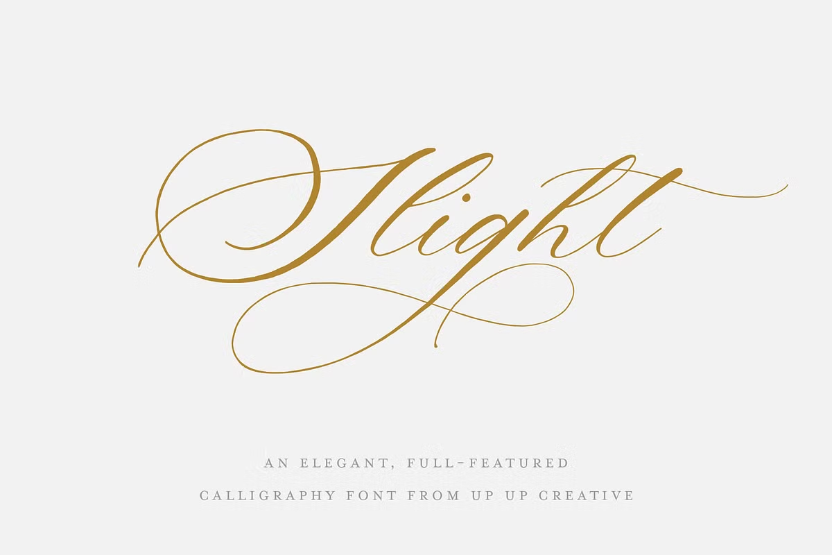
Slight Font is a script font, and it leans toward a casual, handwritten style. The strokes look like they were written with a steady pen, not a brush. There is a gentle slant, but it does not feel rushed or messy. The overall impression is calm, approachable, and slightly playful, which makes it easy to like at first sight.
The designer is unknown, and that can sometimes make long-term use a bit tricky, especially for serious branding. When I do not know the foundry, I pay closer attention to technical details. I look for odd curves, rough anchors, and spacing issues that might show up at different sizes or on print.
The letterforms in this font family are round and open, with soft joins between strokes. Lowercase letters connect smoothly, and the baseline rhythm stays steady, which helps word shapes read clearly. Spacing is fairly tight, so it works best with a little tracking added for headlines. It handles short phrases well, but long paragraphs feel heavy and tiring. The strength of this typography lies in logos, signatures, and short decorative text, not in body copy or data-heavy layouts.
Where Can You Use Slight Font?
I see Slight Font working best in branding for lifestyle, beauty, and small craft businesses. It suits packaging, social media graphics, and soft, personal visual identity systems. On posters or hero images, its flowing font style draws attention without shouting. It feels like a friendly note rather than a loud headline.
At large sizes, the curves look smooth and clean, and the script character really shines. The joins between letters hold up well on screen and in print. At smaller sizes, especially under 12pt, some fine strokes start to thin out and lose clarity. For small text, I usually pair it with a simple sans-serif or serif typeface to keep things readable.
For pairings, I like using Slight Font for names, key words, or short quotes, then supporting it with a neutral workhorse font. A clean sans-serif gives a nice contrast to the script energy, while a light serif can make the whole layout feel more refined. Used with restraint, Slight Font adds personality to invitations, menus, event graphics, and casual product labels.
Font License
The licence for Slight Font can change depending on where you download it and how you plan to use it. Some sources may allow personal use only, while commercial projects might need a paid or extended licence. I always recommend checking the current licence terms on the official source before using it in client work.
My honest takeaway: Slight Font is a pleasant, easy-going script that works well in short, expressive moments. I reach for it when I need warmth and personality, but I avoid using it for long reading text or highly formal brands.


Leave a Reply