
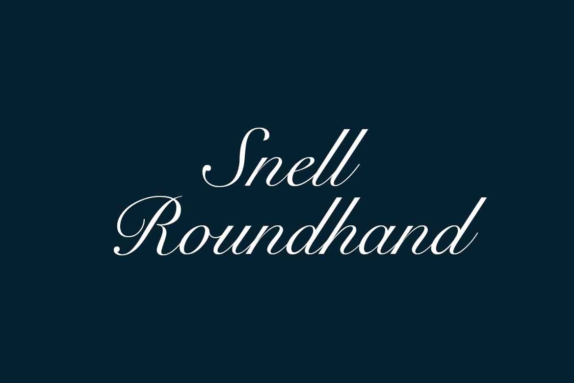

About Snell Roundhand Font
My first reaction to the Snell Roundhand Font was simple: it feels graceful but also quite formal. I reached for it when I needed something elegant for a wedding-style layout. The flowing strokes looked promising, so I wanted to see how it behaved in a full design system.
What drew me in most was the classic script flavour. It reminded me of careful handwriting with a fountain pen, full of curves and flourish. I tested it across invites, logo sketches, and a few mock branding pieces for Free Fonts Lab to understand where it truly shines and where it starts to struggle.
Font Style & Design Analysis
From my point of view, this is a traditional script typeface with a strong calligraphy influence. The strokes feel smooth and deliberate, like formal penmanship lessons written on lined paper. It leans clearly towards a luxury and elegant mood, rather than casual handwriting or playful lettering.
As far as I know, Snell Roundhand Font comes from a long-standing professional foundry, with roots in classic engraving and print work. Its history sits in the world of refined stationery and high-end print, so it naturally carries that tone. If exact historical details matter to your project, I would still double-check official sources.
Looking closely at the letterforms, I notice tight, sweeping curves, strong entry strokes, and bold exit tails on many characters. The spacing feels compact, which helps in short headlines but can crowd longer lines. In use, the rhythm is flowing but quite dense, giving a rich, decorative texture. That strength also becomes its limit: it adds beauty, yet loses readability when pushed into long blocks of text.
Where Can You Use Snell Roundhand Font?
In real projects, I found Snell Roundhand Font works best for special moments, not everyday text. It fits wedding invitations, formal certificates, event titles, and classic logo marks. When set large, the details show clearly, and the dramatic curves feel confident, especially on printed pieces like menus and greeting cards.
On screen, I use it mainly for short headings or hero words, never for body copy. At small sizes, the loops and flourishes merge, which hurts clarity. For brand work, I like pairing this font with a clean sans-serif font family, letting the script carry emotion while the supporting typeface keeps things readable and modern.
For more decorative layouts, it suits perfume packaging, boutique labels, and upscale restaurant branding, where a refined visual identity matters. I avoid it for young or tech-focused audiences, as the vibe is too formal. It feels right when you want respect, heritage, and ceremony, not speed or casual energy.
Font License
From a licensing angle, Snell Roundhand Font usually requires a proper licence for commercial projects. Personal testing might be allowed, but terms can change. I always check the official source or foundry information before client work, especially for logos, packaging, or apps. That habit has saved me from legal trouble more than once as a designer.
My honest takeaway as Ayan Farabi: this font is a beautiful tool when used with care. I reach for it when a project needs ceremony and polish, and I keep it away from long reading text. With smart pairing and thoughtful sizing, it can add a strong, graceful voice to the right design.


Leave a Reply