

About Spartan Font
I came to the Spartan Font while working on a clean interface for a small web app. I needed something modern, neutral, and calm that would not fight with the UI components. Many popular sans fonts felt either too cold or too familiar, so I decided to give this one a closer look.
My first tests were simple: headings, body text, and a few button labels in different weights. I wanted to see how the font family behaved in a real layout, not just in a specimen. As I tried it in both light and dark themes, I started to notice where it shined and where it needed more care. That mix of promise and small quirks made me keep exploring it for Free Fonts Lab.
Font Style & Design Analysis
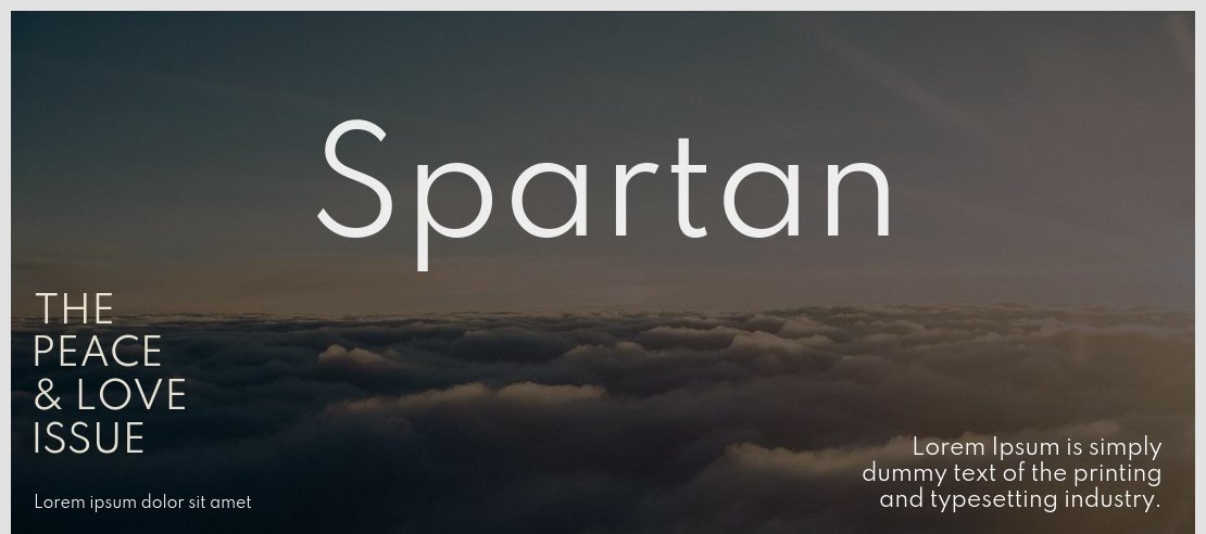
Spartan Font is a sans-serif typeface with a clear geometric base and a restrained personality. Strokes feel even and tidy, and the shapes lean toward circles and straight lines rather than organic curves. The overall impression is neat and contemporary, without loud features or extreme contrast. It aims for clarity and order, not drama.
The original design of this font traces back to historical geometric models, but in many digital releases the designer is unknown or the credit chain is not fully clear. What matters in day-to-day work is how consistent the drawing feels across weights and styles. In my tests, the family stayed stable enough for interface and editorial use.
The letterforms show simple construction: open counters, modest terminals, and a uniform rhythm that runs across lines. Spacing leans slightly tight at larger sizes, which helps headlines look compact and strong. At smaller sizes, that same spacing can feel a bit dense, so extra tracking sometimes helps. The mood is functional and rational, which suits structured layouts. Its main strength is clarity in grids and systems; its weakness appears when you need warmth or strong character.
Where Can You Use Spartan Font?
I find Spartan Font most at home in digital products, dashboards, and clean websites. In large sizes, its geometric sans-serif shapes make navigation labels and section headings look ordered and confident. It also holds up well in hero text where you want a modern, quiet tone instead of a flashy display style.
For long paragraphs, especially on screens, it does the job but needs a bit of help. Slightly increasing line spacing and letter spacing improves reading comfort, especially for younger or non-design audiences. In print, it works for short brochures, captions, and data tables, but I still prefer pairing it with a softer serif or humanist sans for dense reading.
Branding-wise, I would use this typeface for tech startups, SaaS tools, or minimal lifestyle brands that value structure and simplicity. It pairs nicely with a contrasting serif for editorial work, or with a rounded sans for friendlier projects. In UI layouts, mixing a bold weight for titles and a regular weight for labels keeps hierarchy clear without needing too many font styles.
Font License
Licensing for Spartan Font can vary between releases, so I never assume it is free for every use. Before using it in client or commercial projects, I always check the official source for current licence terms, including desktop, web, and app rights. That small step avoids problems later.
For me, this font is a solid, practical choice when I need a calm geometric voice that stays out of the way and supports the design system instead of dominating it.


Leave a Reply