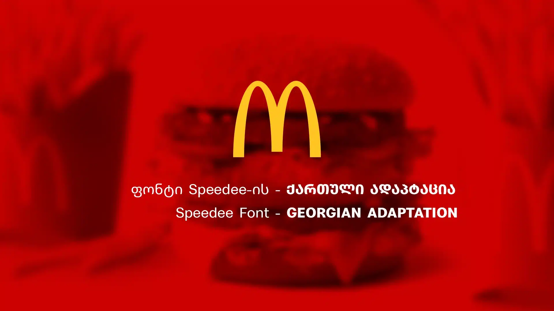
About Speedee Font
I came across Speedee Font while working on a fast-paced tech landing page. I needed a clean typeface that still felt lively and modern. Many options looked either too cold or too playful, so I kept searching until this one caught my eye with its clear shapes and energetic flow.
What drew me to Speedee Font was its balance. It looked simple enough for interface work, but not dull. I tested it on headings, buttons, and short promo lines for a prototype I was building for Free Fonts Lab. I wanted to see if it could support strong typography without stealing the whole show.
Font Style & Design Analysis
Speedee Font is a sans-serif typeface with a clean, contemporary look. The design leans towards a streamlined, slightly geometric style, but it still keeps a friendly tone. Strokes feel even and controlled, which gives the font family a neat, organised voice on the page.
The designer of Speedee Font is designer unknown, at least from the sources I could check. Without a clear foundry name, I had to rely only on what I saw in real use. That pushed me to test the font more deeply, instead of trusting any formal description or bold claims.
The letterforms are clear, with open counters and a steady rhythm across lines. Spacing is fairly tight by default, which helps headings feel compact and solid. In body text, I found I sometimes needed a touch more tracking for comfortable reading. Speedee Font sets a confident mood, great for modern brands, but it is less suited to very long reading-heavy layouts.
Where Can You Use Speedee Font?
In my tests, Speedee Font worked best in display roles: hero headings, section titles, and bold UI labels. At larger sizes, the sans-serif forms stay sharp and legible, and the tidy structure supports strong visual identity work. It communicates speed, clarity, and a light tech edge without feeling harsh.
At smaller sizes, such as captions or compact UI text, the font remains readable, but it prefers decent screen quality and careful spacing. I would not pick it for dense book pages or long essays. It shines more in short bursts of copy, dashboards, banners, or product cards, where clarity and impact matter more than reading for hours.
I had good results pairing Speedee Font with a softer serif for body text, letting Speedee handle the headings and key numbers. It also pairs well with a neutral sans for microcopy, so it becomes the voice for main statements. I would use it for tech products, delivery services, sports gear, and youth-focused brands that want a quick, direct tone.
Font License
The licence terms for Speedee Font can vary depending on where you get it. Before using it in client work or commercial branding, always read the official licence details. Check permissions for desktop, web, and app use carefully, and make sure both personal and commercial needs are clearly covered.
For me, Speedee Font is a handy choice when I need a clean, fast-looking sans-serif that supports bold headings and modern layouts without much fuss.


Leave a Reply