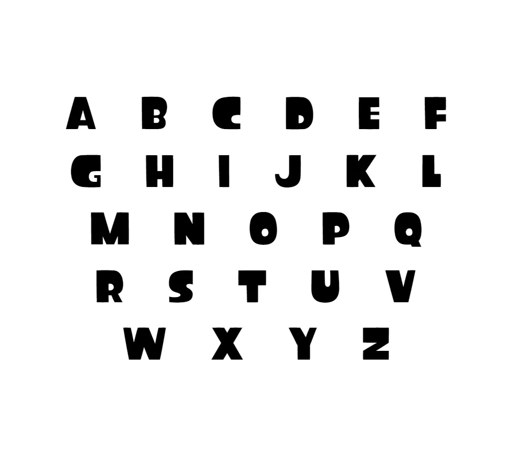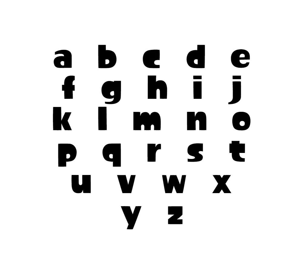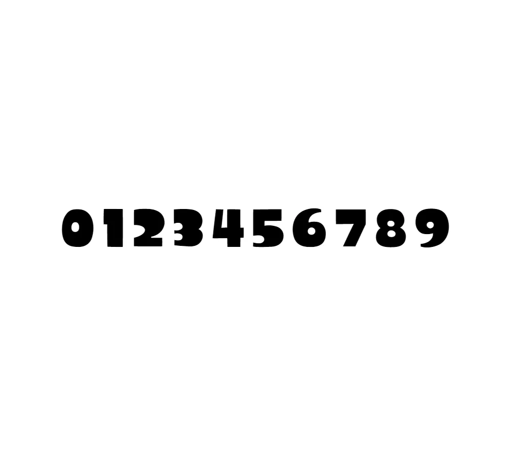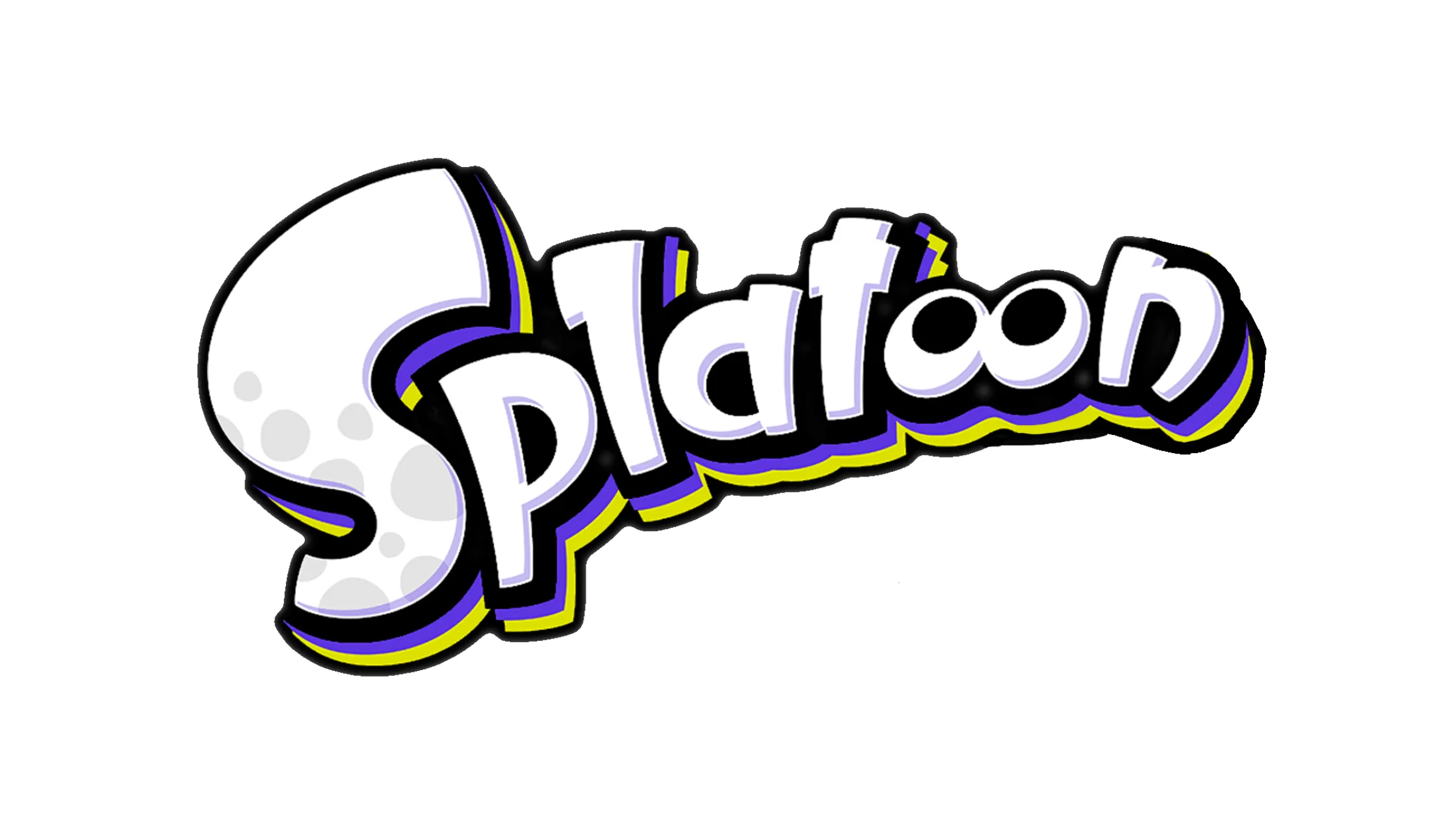


Introducing the Splatoon font – a font that captures the energetic and playful spirit of the popular video game created by Nintendo. Let me tell you all about this unique font and how it came to be.
Derived from the Splatoon video game, this font is perfect for capturing the fun and dynamic feel of the game. Like Fortnite and other shooting games, Splatoon is a multiplayer game that requires strategy and quick reflexes. The Splatoon font, with its bold and eye-catching appearance, is the perfect match for this exciting game.
The closest font we can find for the game logo is Dreamland, a bold and top-heavy style inspired by mid-20th century poster lettering. Dreamland has a lowercase and informal feel, making it a great choice for designs that require a playful and relaxed vibe. However, the Splatoon font takes inspiration from Dreamland and gives it a modern twist, making it perfect for designs that require a touch of creativity and energy.
Whether you’re designing a video game or creating marketing materials for a business, the Splatoon font is a versatile choice. Its bold and striking appearance makes it a great option for designing game logos, branding materials, and even social media graphics. It’s a font that’s sure to grab the attention of anyone who sees it.
In conclusion, the Splatoon font is a font that captures the energetic and playful spirit of the popular video game created by Nintendo. Its bold and top-heavy style, inspired by mid-20th century poster lettering, makes it perfect for designs that require a touch of creativity and energy. So go ahead and give the Splatoon font a try – it’s a font that’s sure to make your designs stand out from the rest!


