
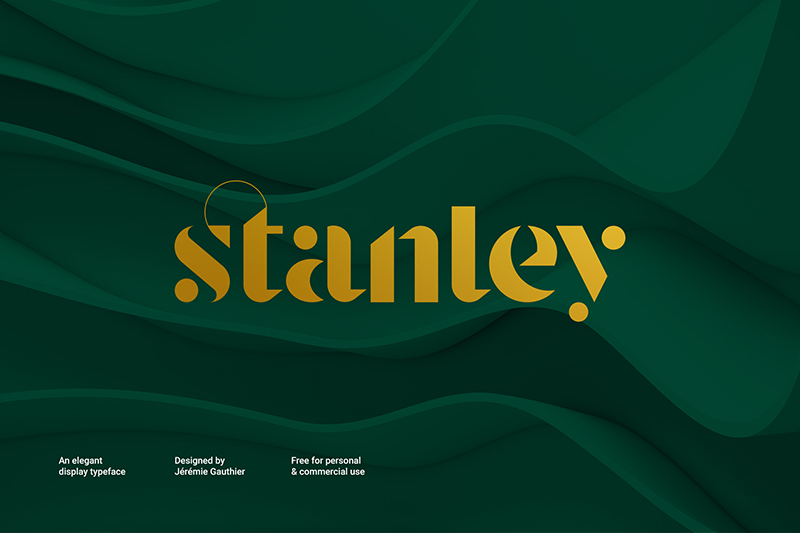

About Stanley Font
I first picked up the Stanley Font while working on a book cover that needed a calm, classic tone. The client wanted something serious, but not cold or stiff. I was searching through serif options and this one caught my eye because it felt both elegant and grounded at the same time.
What drew me in was the balance between sharp details and soft curves. It looked like a typeface that could carry long text, but still stand out in headings. I decided to test it for that cover and later wrote about the experience for Free Fonts Lab, because the font family behaved in a very dependable way during layout work.
Font Style & Design Analysis
The Stanley Font is a serif typeface with a clear, traditional structure. The strokes feel steady, with classic contrast between thick and thin lines, but nothing looks overly dramatic. Its font style sits in a comfortable middle ground between bookish and display, which makes it easy to place in many layouts without drawing the wrong kind of attention.
The designer of this font is unknown, at least from the sources I could find with confidence. That said, the design language suggests someone who studied old-style book typography carefully. The decisions feel thoughtful, from the shape of the terminals to the way the serifs sit on the baseline. Nothing seems rushed or random here.
Looking closely at the letterforms, the lowercase letters have a gentle rhythm that reads smoothly in blocks of text. The spacing feels slightly tight by default, so I often add a bit of tracking for small body copy. Capitals are strong but not shouty, which makes them work nicely for subheadings. The serif details give a calm, trustworthy mood, but they also limit its use in very playful or ultra-modern brands. It shines when the visual identity needs maturity, clarity, and quiet confidence.
Where Can You Use Stanley Font?
In my tests, the Stanley Font performed best in editorial and brand work that needed a classic voice. It works very well on book covers, magazine spreads, and thoughtful blog layouts. At larger sizes, like titles and pull quotes, the serif details feel refined and give the page a literary touch without looking old-fashioned.
For small sizes, such as footnotes or captions, the typeface stays legible as long as you give it enough line spacing. I avoid using it at very tiny sizes on low-resolution screens, because the finer strokes can lose clarity. When I pair it, I usually match it with a clean sans-serif for body text or UI elements, which keeps the typography system easy to scan.
Branding-wise, this font fits well for publishers, consultancies, heritage brands, and any project that wants stability and polish. It would be less suitable for youth-focused products or very bold tech startups. Used as a primary serif in headings, with a neutral sans for supporting text, it builds a strong visual identity that feels steady and professional.
Font License
The licensing for the Stanley Font can vary depending on where you download it from. I always treat it as a case-by-case situation for personal and commercial projects. Before using it in any client work, I strongly recommend checking the official source and reading the licence terms carefully. My own rule is to double-check, even if it seems free.
My personal takeaway as Ayan Farabi: I reach for this font when I need a reliable serif that supports the design quietly, instead of trying to steal the show.


Leave a Reply