

About Stay Puft Font
I first tried the Stay Puft Font while working on a set of playful social media posts for a small snack brand. The client wanted something casual, friendly, and a bit messy, but still readable at a quick glance. I needed a handwritten style that felt fun, not childish.
During testing for Free Fonts Lab, this font stood out because it had that loose, scribbled look without losing structure. It looked like someone wrote with a thick marker on paper, then cleaned it up just enough for design use. That balance made me curious to see how far I could push it in layouts.
Font Style & Design Analysis
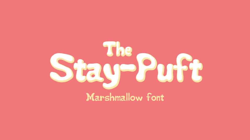
The Stay Puft Font is a handwritten typeface with a chunky, relaxed personality. Letters feel bold, soft, and slightly rounded, like strokes drawn with a fat marker or paint pen. The texture is clean, but the shapes keep a human touch. It leans towards playful, casual typography rather than neat notebook handwriting.
The creator of this font is designer unknown, at least from the sources I could check. That sometimes happens with popular free fonts that spread across many sites. Even with no clear author credit, the font family shows a clear sense of direction and intent, which suggests a designer who understood informal display lettering very well.
The letterforms are wide and confident, with generous curves and closed counters that still breathe. Spacing is fairly tight, so words form strong, solid blocks of text. This works well for short headlines, but less so for dense paragraphs. The rhythm feels bouncy and energetic, which brings warmth, but can also feel loud if used everywhere. Its handwritten category is clear, yet it behaves best as a display accent rather than body copy.
Where Can You Use Stay Puft Font?
I find the Stay Puft Font most effective in bold, playful branding or campaign graphics. Think snack packaging, kids’ events, craft workshops, or casual food trucks. At large sizes, the handwritten curves look inviting and friendly. The strong strokes hold up well on screens, posters, and banners without breaking or thinning out.
At smaller sizes, the tight spacing and chunky shapes can start to merge, especially in longer words. For that reason, I avoid using it for body text, captions, or fine print. Instead, I pair it with a clean sans-serif for paragraphs, letting the handwritten style handle titles, buttons, stickers, or callouts. This mix keeps the visual identity playful but still clear.
The font works nicely in layouts that need a personal, human tone without going full script. It suits audiences such as teens, families, and creative brands that want a relaxed voice. I have used it in moodboards, logo sketches, and header treatments, where a single short word or phrase can carry a lot of character. In those spots, the Stay Puft Font adds just the right amount of fun.
Font License
Before you use the Stay Puft Font in client work or commercial projects, always check the licence on the original source. Some sites may allow personal use only, while others may permit wider use with clear terms. I never assume a font is free for all purposes, and I recommend you do the same.
For me, this typeface is a handy option when I need bold, handwritten warmth without getting too messy. Used with care and good pairing, it can bring a friendly edge to many small, informal projects.


Leave a Reply