
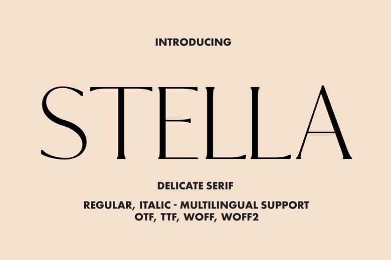

About Stella Serif Font
I first tried the Stella Serif Font while working on a calm, book-style brand for a small publisher. I needed a serif typeface that felt gentle but still clear and firm. Many options looked either too harsh or too decorative for long reading.
Stella Serif Font caught my eye because its shapes feel friendly, yet still organised. It has that classic book look, but with softer details that make it less cold. I tested it in headings, pull quotes, and short body text layouts for a feature at Free Fonts Lab, just to see how it behaved in real projects.
Font Style & Design Analysis
Stella Serif Font is a serif typeface with a quiet, literary feel. The serifs are not too sharp or too thick, so the whole font sits in a comfortable middle ground. It looks like something you might see on a modern book cover, with enough personality to stand out without shouting.
The designer is unknown, but the font family feels like it was drawn by someone who studies classic book typography. The structure follows traditional proportions, yet some curves show a lighter, more modern touch. It gives the sense that the designer wanted a bridge between old-style print and current digital layouts.
The letterforms have open counters and a steady rhythm, which helps with reading at medium sizes. Spacing is slightly tight by default, so I found myself adding a bit of tracking for headlines. The mood leans thoughtful and calm, not playful or loud. It works best in titles, quotes, and short paragraphs, but I would not choose it for very tiny text, as the fine serif details can start to blur on low-resolution screens.
Where Can You Use Stella Serif Font?
I see Stella Serif Font working well in editorial layouts, book covers, and brand systems that want a soft literary voice. It suits projects for writers, small publishers, therapists, lifestyle blogs, and boutique shops that favour calm, story-led design. The serif nature of the font gives it a sense of trust and tradition.
At larger sizes, the font style shows its grace. Headlines, chapter titles, posters, and social media graphics all benefit from its elegant curves and well-shaped serifs. In these cases, I often add a bit of letter spacing to let the typography breathe. Pairing it with a clean sans-serif for body text creates a clear visual hierarchy and a balanced visual identity.
At smaller sizes, like footnotes or dense body copy, Stella Serif Font is usable, but it demands care. I found it works better for short paragraphs, captions, and quote blocks, not long technical documents. If you plan to use this serif font in a full layout, test it on both print and screen to see how the details respond under different conditions.
Font License
The licence for Stella Serif Font can change depending on the source, so I never assume anything. Before using it in client work or commercial projects, check the official licence terms carefully. Make sure it covers desktop, web, and any large-scale use you need.
For me, Stella Serif Font is a quiet, reliable choice when I want a gentle serif voice without heavy ornament. It will not suit every project, but when the tone is calm, bookish, and sincere, it earns a place in my toolkit.


Leave a Reply