
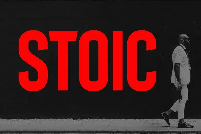

About Stoic Font
My first reaction to Stoic Font was calm and curious. The name felt strong, almost quiet, and the shapes backed that up. I saw a firm voice without drama, which made me think of clear headlines and simple brand work. The mood felt steady rather than loud.
What pulled me in most was its balance of order and personality. I wanted to see if it could handle clean layouts, without looking cold or generic. So I tested it across a few mock brand systems and editorial pages for Free Fonts Lab. Stoic Font looked like it might fit designers who enjoy controlled, modern typography.
Font Style & Design Analysis
From my tests, Stoic Font reads as a modern display typeface with a minimal, elegant tone. The overall font style leans towards crisp, sharp shapes that feel deliberate. It seems made for strong titles rather than long reading blocks. There is a quiet confidence in how the letters sit together on the page.
The exact creator of this font is unclear, so for now I will note the designer unknown. That does not change how it behaves in real layouts, but it does matter when you look for licensing details or updates. Without a known foundry, I tend to be extra careful before using it in brand work.
Looking closely at the letterforms, I noticed tight control over curves and angles. Strokes feel even, with little contrast, which adds to the steady rhythm. Spacing is modestly compact, so headlines feel contained rather than airy. This is a strength for posters and hero text, though it can feel a bit stiff in dense copy. The mood stays serious and mature, so it is not ideal for playful, friendly projects.
Where Can You Use Stoic Font?
In real use, I found Stoic Font works best in larger sizes. Titles, taglines, and short quotes feel bold yet composed. On posters, landing pages, and cover designs, it holds attention without shouting. At big scales the details become clear, and the minimal display character really helps shape the visual identity.
Small text is where I needed to be more careful. At body size, the compact spacing and rigid shapes can feel tight on the eyes. For long paragraphs, I preferred pairing it with a softer serif or humanist sans-serif font family. Using Stoic Font just for headings and pull quotes gave me a better rhythm across the layout.
Branding work is where this typeface started to make real sense for me. Serious products, tech services, architecture studios, or editorial brands can all gain from its calm, structured look. It suits audiences who expect clarity and restraint. When I combined it with generous white space and simple grid systems, the typography felt thoughtful rather than cold.
Font License
The licence for Stoic Font may vary depending on the source you obtain it from. Some versions may allow personal use only, while commercial projects could need a paid or extended licence. I strongly suggest checking the official licensing terms before using it in any client or commercial work. My own takeaway as Ayan Farabi is that careful testing and clear licensing checks make Stoic Font a reliable option when you want measured, modern display typography.


Leave a Reply