

About Stone Age Font
I came across Stone Age Font while searching for a rough, playful headline style for a kids’ dinosaur poster. The name sounded gimmicky, but the shapes felt surprisingly controlled. I decided to test it properly, not just drop it into one layout and move on.
During that test, I tried it across posters, social posts, and a simple game logo. I wanted to see if it could handle both fun and clarity. For Free Fonts Lab, I also checked how it behaved in different colours and textures, because many display fonts break down quickly once you push them.
Font Style & Design Analysis
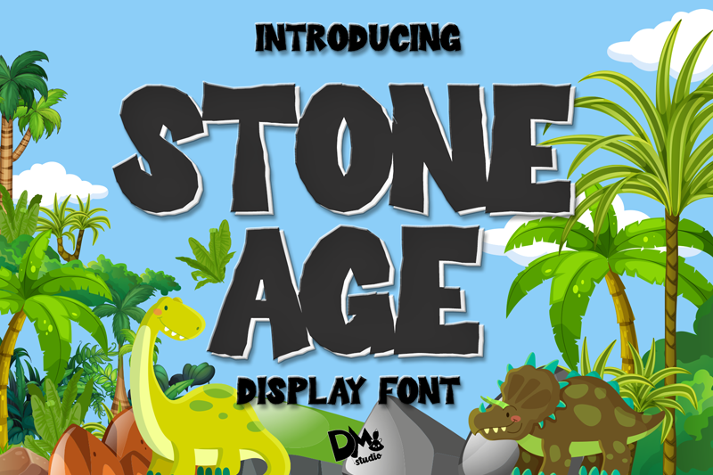
This is a display typeface built around chunky, uneven forms that suggest carved stone. Each letter has a slightly jagged outline, like chipped rock, but the core geometry stays readable. The whole font style leans toward cartoon prehistoric rather than strict realism, which keeps it friendly instead of harsh.
The designer is unknown, and that shows in the lack of deep documentation or a broad font family. There is usually just one main weight, which is common for small display projects. Still, the idea behind the letterforms feels clear, so it does not look like a random novelty font thrown together.
The letterforms are bold, tall, and quite closed, with tight spacing that creates a dense line. That density gives strong impact in short words, but longer text can feel heavy fast. Curves on O, C, and G look like chipped boulders, while angled strokes on A, N, and V add rhythm. It works well for loud typography, but not for subtle moods or delicate layouts. As a display font family, its strength is big, short, punchy text.
Where Can You Use Stone Age Font?
I find Stone Age Font most useful for projects that need a fun, primitive theme: dinosaur parks, kids’ events, craft fairs, or simple game titles. It shines in posters, banners, and covers, where you only need a few words. Large sizes let the rough edges and stone effect read clearly.
In smaller sizes, like body text or long captions, the texture becomes noise and hurts legibility. I keep it for headings, logos, badges, and short callouts. For layout balance, I pair it with a very clean sans-serif for body copy. That contrast keeps the visual identity strong without tiring the reader.
It can also work for seasonal graphics, like treasure hunts or themed party invites, where you want bold, playful typography that does not feel too serious. On dark backgrounds with light text, the carved look becomes stronger. I avoid using more than two lines in this font style, otherwise the page starts to feel cramped and noisy.
Font License
The licence for Stone Age Font can vary depending on the source, so I never assume it is free for all use. Always check the current licence terms at the original download page, especially for client work, logos, or products. When in doubt, I treat it as personal-use only until I confirm permission.
For me as Ayan Farabi, this font is a fun, focused tool: great for loud, short headlines when I want that carved-stone voice, but not something I lean on for complex, text-heavy design systems.


Leave a Reply