

About Street Fighter Font
I first reached for the Street Fighter Font while working on a retro arcade event poster. The client wanted something loud, sharp, and instantly readable from a distance. I needed a title style that felt like an action game splash screen, but still worked inside a clean layout.
As I tested it, the font gave me a clear energy that many bold display faces miss. It felt dramatic without becoming messy. I decided to study it more deeply for Free Fonts Lab, because this kind of logo-driven typeface can be tricky to control in real design work.
Font Style & Design Analysis
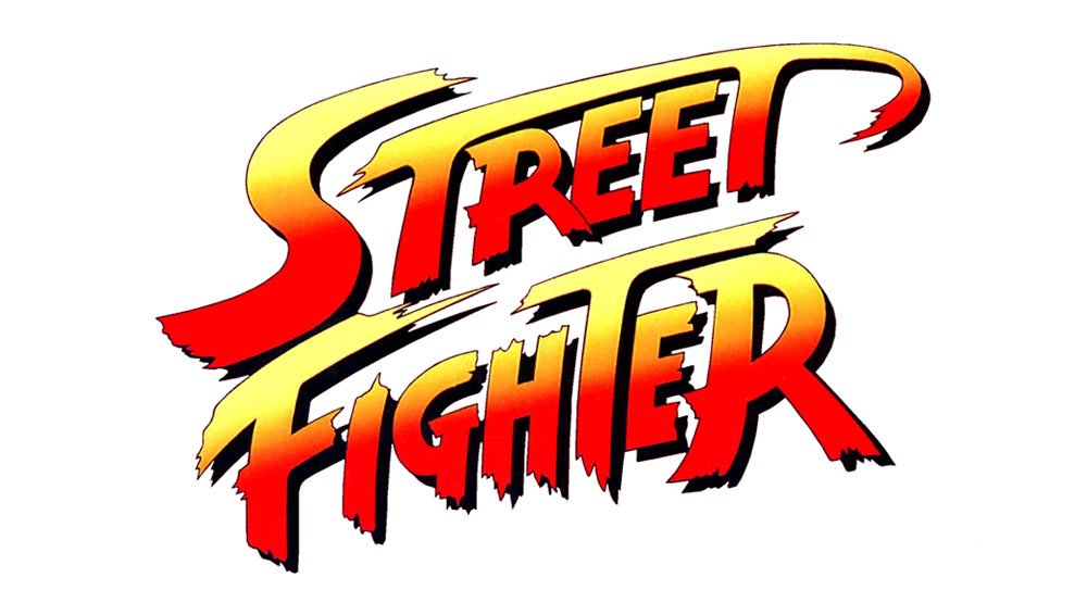
The Street Fighter Font is a pure logo typeface, built for impact rather than long reading. Its visual direction leans heavily on sharp angles, strong diagonals, and thick strokes. The letterforms look like they are in motion, which gives it that arcade fighting game feel and a very bold visual identity.
The designer is unknown, and that actually shows in a small way. The font family feels more like a custom wordmark extended into a set of letters, rather than a full professional system. That is not a bad thing, but it affects how I approach it in branding or typography-heavy layouts.
Many letters have aggressive cuts and exaggerated curves, especially in capitals. Spacing is tight, almost compressed, which helps for logo-style lockups but can hurt readability in longer text. The rhythm feels punchy and uneven by design, so it works best for short words and dynamic titles. Its biggest strength is impact; its main limitation is subtlety.
Where Can You Use Street Fighter Font?
I see the Street Fighter Font working best for game logos, esports branding, and event posters aimed at younger or nostalgic audiences. At large sizes, the jagged shapes and bold strokes really shine. On a dark background with bright colour, it gives a strong action vibe that is hard to miss.
At medium sizes, like subtitles or menu labels, you need to watch spacing and word length. Long phrases can start to feel heavy and cramped. For small text, I would avoid this typeface entirely and pair it with a simple sans-serif or clean serif font style, keeping Street Fighter for headings only.
For packaging, streetwear branding, or YouTube thumbnails, this logo font can add strong character if used with restraint. Short names, game titles, or taglines work well. I usually keep plenty of white space around it and avoid using it in all caps for long words, as that quickly becomes noisy.
Font License
The licence for the Street Fighter Font can vary, especially because many game-inspired fonts come from different sources. Do not assume it is free for commercial work, even if it appears on free sites. Always check the official licence details before using it in client projects or paid branding.
For me, this font is a fun, high-impact tool that I only bring out when a project truly needs that arcade punch. Used carefully, it can deliver strong results.


Leave a Reply