
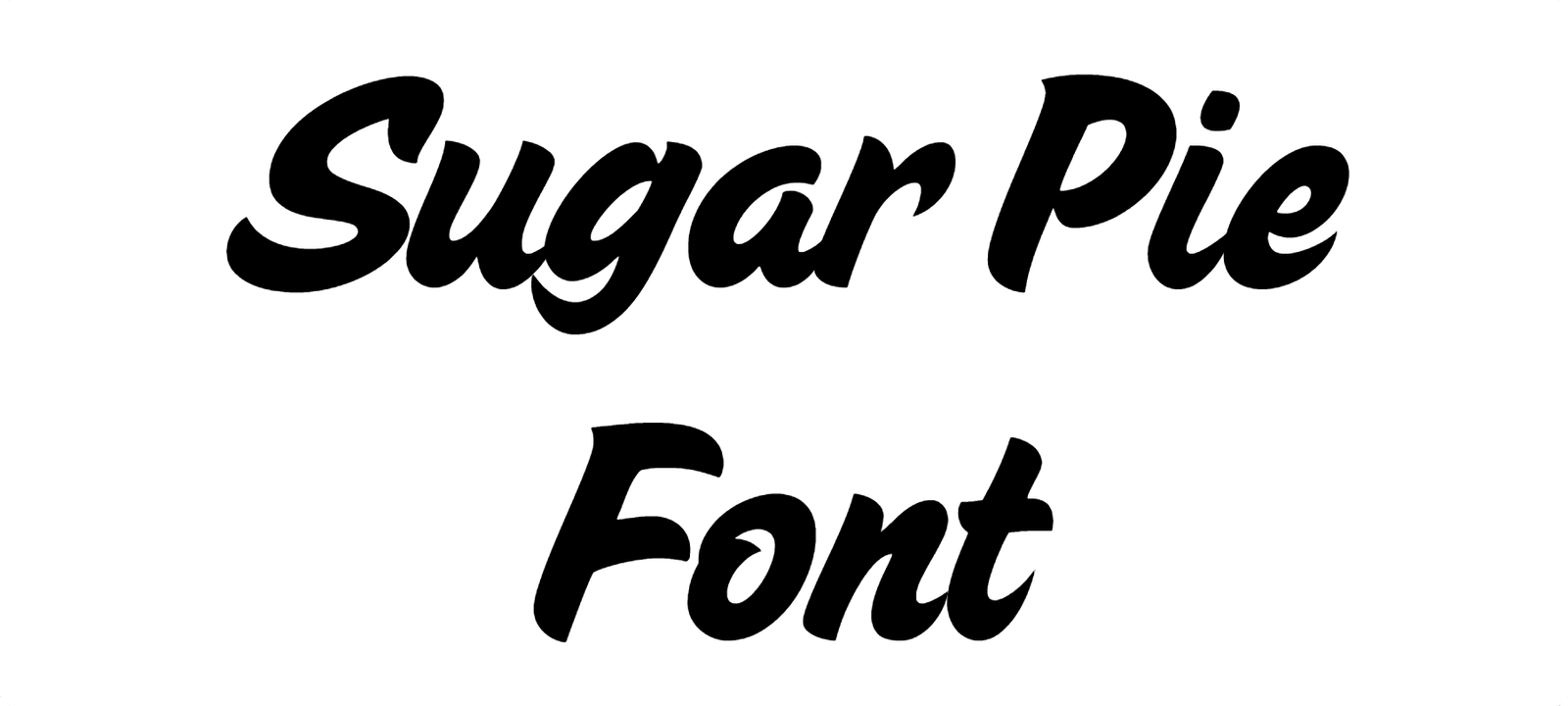

About Sugar Pie Font
I first tried Sugar Pie Font while building a sweet, playful logo for a small bakery rebrand. The client wanted something light, friendly, and a bit romantic without feeling childish. I went hunting through my script collection and this one stood out right away.
The curves felt soft, but the letters still read clearly at a glance. I brought it into my test layout, set a few sample words, and liked how it handled short phrases. That first try led me to explore it further for headings, packaging mockups, and a few social post concepts for Free Fonts Lab.
Font Style & Design Analysis
Sugar Pie Font is a script font, and it leans into that style with smooth, looping strokes and gentle curves. The letters connect in a flowing line, giving the text a handwritten, personal feeling. It looks like neat brush pen writing, but more polished and controlled than casual notes.
The designer is unknown, but the work suggests a steady, confident hand. The strokes keep a clear direction, with moderate contrast between thick and thin parts. It does not try to be wild or messy. Instead, it sits in a safe, approachable space that many branding projects can use comfortably.
The letterforms have rounded terminals and a pleasing rhythm from left to right. Spacing is fairly tight, as you would expect from a script, but it stays readable when you give it enough size. The mood is warm, sweet, and a bit nostalgic, which suits greetings, wedding pieces, and food branding. Long blocks of text feel heavy and busy, though, so I keep it for headings, names, and short phrases rather than paragraphs.
Where Can You Use Sugar Pie Font?
In my tests, Sugar Pie Font worked best in larger sizes, such as logos, main headlines, and packaging titles. On cake boxes and pastry labels, it gave a friendly, homemade tone without looking sloppy. At smaller sizes, the loops compress, so I avoid using it for body copy or long captions.
I found it very suitable for bakery brands, dessert shops, craft businesses, and DIY-style event graphics. It also fits Valentine cards, wedding invitations, and baby shower designs, where a soft script font feels natural. For more serious or corporate projects, the playful energy feels slightly out of place, so I reach for other families.
For pairing, I usually combine Sugar Pie Font with a clean sans-serif font for body text and small labels. A simple, neutral font family beside it lets the script do the expressive work while keeping the layout readable. I also give it generous line spacing and clear margins, so the connected script letters have room to breathe.
Font License
The licence for Sugar Pie Font can differ depending on where you get it, and terms may change over time. I never assume it is free for commercial work. Before using it in client projects or products, I always check the official source for current licence details and usage rights.
For me, Sugar Pie Font is a nice option when I need a gentle, sweet script that feels approachable and tidy. I use it with care, in short phrases and clear layouts, and it rewards that restraint with charming, readable results.


Leave a Reply