

About Sunlight Font
I came across Sunlight Font while I was searching for a soft, friendly script for a small café brand. The client wanted something warm, but not childish, and nothing that looked like every other brush script on social media. The curves and gentle flow caught my eye right away.
I decided to test it in a full logo lockup and some menu headings, then wrote a short social post layout to see how it behaved in longer words. For Free Fonts Lab, I focused on how this typeface holds up in real layouts instead of just looking nice in a sample image.
Font Style & Design Analysis
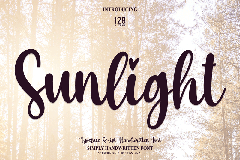
This is a pure script typeface with a calm, smooth movement from letter to letter. The overall font style feels handwritten, but slightly cleaned up for branding use. Strokes are mostly even, with gentle contrast that keeps the shapes soft rather than sharp. It leans more elegant than playful, while still feeling approachable.
The designer is designer unknown, at least from what I could confirm from the original source. That limits how much backstory I can share, but the design choices speak quite clearly. You can sense that it was built with display use in mind, especially for logos, packaging, and short headings.
The letterforms have wide, open counters and rounded terminals that give a friendly tone. Lowercase connections are fairly consistent, so words flow without sudden breaks. Spacing is on the tight side, which works well for large titles but can feel cramped in small sizes. The rhythm is smooth, but some pairs need manual kerning in logo work. Its strength lies in short phrases; long paragraphs become harder to read and lose that elegant rhythm.
Where Can You Use Sunlight Font?
I see Sunlight Font working best in branding, packaging, and social graphics where you need a warm, personal voice. It suits boutique cafés, small beauty brands, handmade product labels, and wedding stationery quite well. The script style creates an instant sense of personality without feeling messy or rushed.
At large sizes, this script font looks confident and clear. Logos, wordmarks, and hero headlines on posters are its natural home. In smaller sizes, especially body text, the joined letterforms start to blur, so I would not use it for long reading. For small captions, pair it with a clean sans-serif or serif font family for balance.
When I tested it in layouts, I liked pairing it with a simple geometric sans for menus and Instagram posts. I used Sunlight Font for key words or names, then kept prices and details in a neutral supporting typeface. This contrast helps the script stand out and keeps the visual identity readable and modern.
Font License
The licence terms for Sunlight Font can vary depending on where you download it. Some sources may allow personal use only, while others may offer commercial rights. I strongly recommend checking the current licence on the original source before using it in client work or paid projects.
My honest takeaway as Ayan Farabi: I reach for Sunlight Font when I need a gentle, modern script that feels human but still controlled, mainly for short, expressive branding moments.


Leave a Reply