
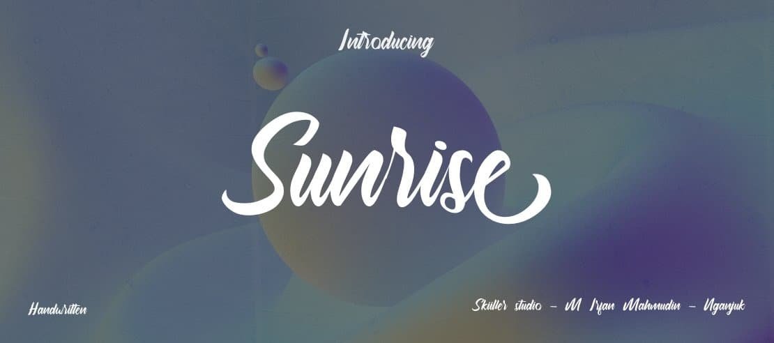

About Sunrise Font
I came across Sunrise Font while working on a relaxed poster for a small local café. I needed a friendly handwritten style that felt warm, but not messy or childish. I wanted something that looked like a real note from a person, not a perfect digital script.
The font caught my eye because its strokes feel casual and calm, almost like a slow morning sketch. I tested it in headlines, short quotes, and menu sections to see how it handled different sizes. For Free Fonts Lab, I paid close attention to how it behaved in real layouts rather than just judging it from a sample image.
Font Style & Design Analysis
Sunrise Font is a handwritten typeface with an easy, relaxed flow. The letters look like they were drawn with a soft marker or brush pen, but they stay very readable. The baseline is slightly loose, and the strokes are rounded, which gives the font a gentle, human mood that suits casual projects.
The exact creator of this font is designer unknown, at least from what I could confirm with normal research. That lack of clear authorship does not change how it works on the page, but it does affect how confident I feel using it for large commercial branding. I would want to double-check the source before committing to a big identity system.
The letterforms sit fairly tight, with moderate spacing that keeps words compact but not cramped. Curves are smooth, and there are no sharp, dramatic angles, which supports a soft tone. The rhythm of the strokes stays consistent, so lines look neat rather than chaotic. Its strength lies in short text, headings, and quotes; longer paragraphs can feel a bit busy. The handwritten character shines when you give it space to breathe.
Where Can You Use Sunrise Font?
I find Sunrise Font most useful in projects that need a friendly, personal touch. It works well for café menus, bakery labels, lifestyle posters, and social media graphics that speak in a warm, human voice. At large sizes, the handwritten details feel clear, and the rounded edges add charm without shouting.
In small text, the font family starts to lose some clarity, especially on screens. I would avoid using it for long paragraphs, captions, or interface text. Instead, I pair it with a clean sans-serif or simple serif for body copy, letting Sunrise handle headings, short phrases, and callouts. This balance keeps the design readable while keeping the personal mood.
For young audiences, craft brands, or cosy lifestyle products, the typography feels very inviting. When I tested it on packaging mockups, it worked nicely for product names and hand-written style notes. The handwritten category nature of this typeface gives it an honest, informal voice, which suits small businesses, personal brands, and any visual identity that wants to feel close and human.
Font License
The licence for Sunrise Font can vary depending on where you download it. Some sources allow personal use only, while others may permit commercial projects. I strongly recommend checking the official licence details on the original source before using it in paid client work or large branding.
For me, Sunrise Font is a good choice when I want warmth and ease, but I keep it for shorter text and carefully check the licence before serious client use.


Leave a Reply