
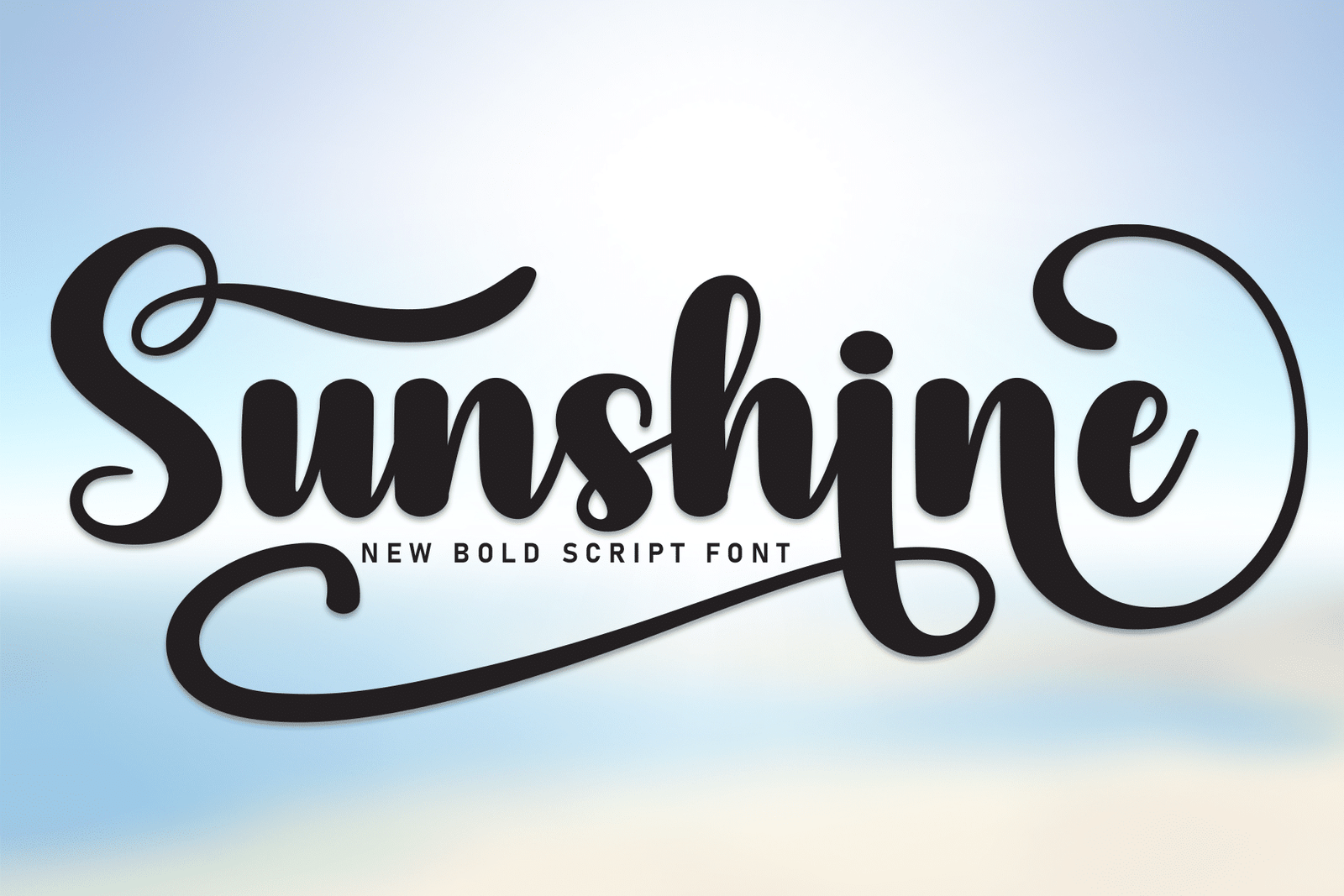

About Sunshine Font
I first reached for Sunshine Font while working on a relaxed summer event poster. I needed a script that felt friendly, loose, and a bit playful, but not messy. Many cursive fonts looked either too formal or too childish, so I wanted something in between.
The curves in this typeface caught my eye right away. The strokes felt smooth and confident, like quick handwriting done with care. I decided to test it deeper for headings, short quotes, and logos, then later wrote up my notes for Free Fonts Lab so other designers could judge if it suits their work.
Font Style & Design Analysis
This is a script typeface with an easy, flowing handwriting feel. The letters connect in a gentle way, with soft curves and rounded ends. It leans slightly to the right, which gives it a casual, human rhythm. The look sits between neat calligraphy and everyday handwriting, so it feels warm rather than stiff.
The designer is unknown, and that shows a bit in how mixed the details can be. Some strokes are very smooth, while others feel a touch crude. Still, the overall font style stays consistent enough for light branding, invitations, and social graphics where you want a personal voice without heavy decoration.
The letterforms are open and mostly easy to read, but the joins between letters can get tight in certain pairs. Spacing is on the loose side, which helps clarity at medium sizes. In long words, the rhythm can look bouncy, almost playful. That is a strength for friendly projects, but a limitation if you need strict, clean typography for serious brands. As a script font family, it works best when you keep text short and let the shapes breathe.
Where Can You Use Sunshine Font?
I found Sunshine Font most useful in display roles, not body copy. It shines in posters, social media graphics, informal logos, and greeting cards. At large sizes, the smooth curves and loops feel expressive and clear. For small captions or long paragraphs, the connected strokes start to blur, so I avoid it there.
For a friendly visual identity, it can work nicely for cafés, small craft brands, and lifestyle blogs. I like pairing this script with a clean sans-serif for body text, so the handwriting style stays as the hero element. A simple, neutral typeface beside it helps balance the lively letterforms and keeps layouts from feeling too busy.
On packaging, it works best for product names or short taglines rather than ingredient lists or instructions. For children’s content or relaxed event posters, the mood feels inviting and calm. If your audience expects strict professionalism, like finance or legal work, this font style will likely feel too casual and soft.
Font License
Before using Sunshine Font in client work or commercial projects, I always double-check the licence from the original source. Terms can change, and some releases allow only personal use. Make sure you read the current licence details so your typography stays both creative and safe. For me, that small step is always worth it.
My honest takeaway: I treat this font as a light, friendly tool for headings and short phrases, not a universal solution. When used with care and paired well, it can add a warm human touch without overpowering the rest of the design.


Leave a Reply