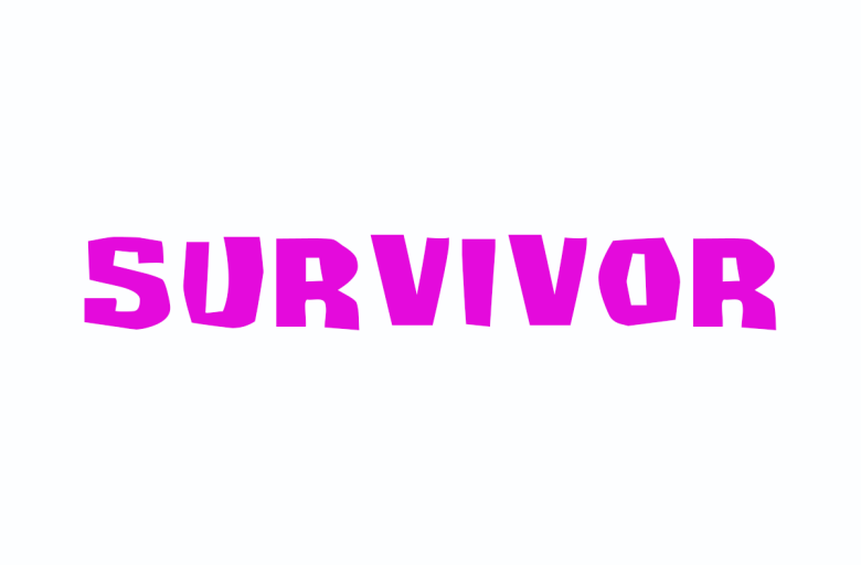
About Survivant Font
I came across Survivant Font while searching for a bold title style for a game poster. I needed something loud, sharp, and a bit rough around the edges. Clean geometric fonts felt too safe, and grunge fonts felt messy. This one sat in a strong middle ground.
I tested it first on a mock cover concept for a survival game case study I was preparing for Free Fonts Lab. The heavy structure, combined with its aggressive shapes, made the name stand out straight away. That test pushed me to explore it deeper and see how far I could stretch this font family inside real layouts.
Font Style & Design Analysis
Survivant Font is a pure display typeface, built to grab attention rather than stay quiet in body text. The design leans into sharp angles, thick stems, and compact forms. It has a rough, post-apocalyptic energy that feels intentional, not sloppy, and it immediately signals tension and conflict in any visual identity.
The designer is unknown, at least from the sources I could check. That said, the work feels focused and deliberate. Details repeat in a consistent way, so it does not look like a random novelty font. You can tell someone thought about rhythm, negative space, and how the letters lock together.
The letterforms are blocky, with tight spacing that pulls words into dense visual units. Many characters use angled cuts and broken edges, which creates a jagged rhythm across the line. This makes the font style strong in large titles, logos, and short phrases. It struggles in long sentences, though, because the texture becomes heavy and tiring to read. As a display font, its strength is impact, not comfort.
Where Can You Use Survivant Font?
In my tests, Survivant Font worked best on posters, game covers, and YouTube thumbnails. At large sizes, the rough edges and bold blocks become a clear graphic element. It gives titles a survival, dystopian, or action-driven mood that feels direct and intense, especially on dark, high-contrast backgrounds.
I would also use this typeface for logos in gaming, extreme sports, or metal music projects, where aggressive typography fits the audience. Set in all caps, the font family feels solid and brutal. Mixed case can work too, but I had more success keeping words short, usually one or two strong terms per line, with plenty of breathing room around them.
At small sizes, the texture starts to blur and some cuts lose definition, so I avoid it for captions or UI text. I usually pair Survivant Font with a simple sans-serif or humanist typeface for body copy. That contrast keeps layouts readable while preserving the intense character in headers. Treat it like a visual spice, not the whole meal.
Font License
The licence for Survivant Font can vary depending on where you download it. Some sources may allow personal use only, while others may include commercial rights. I always recommend checking the official licence details before using it in client work or paid projects.
For me, it has become a niche tool I reach for when a project needs raw, survival-themed energy without feeling completely chaotic.


Leave a Reply