
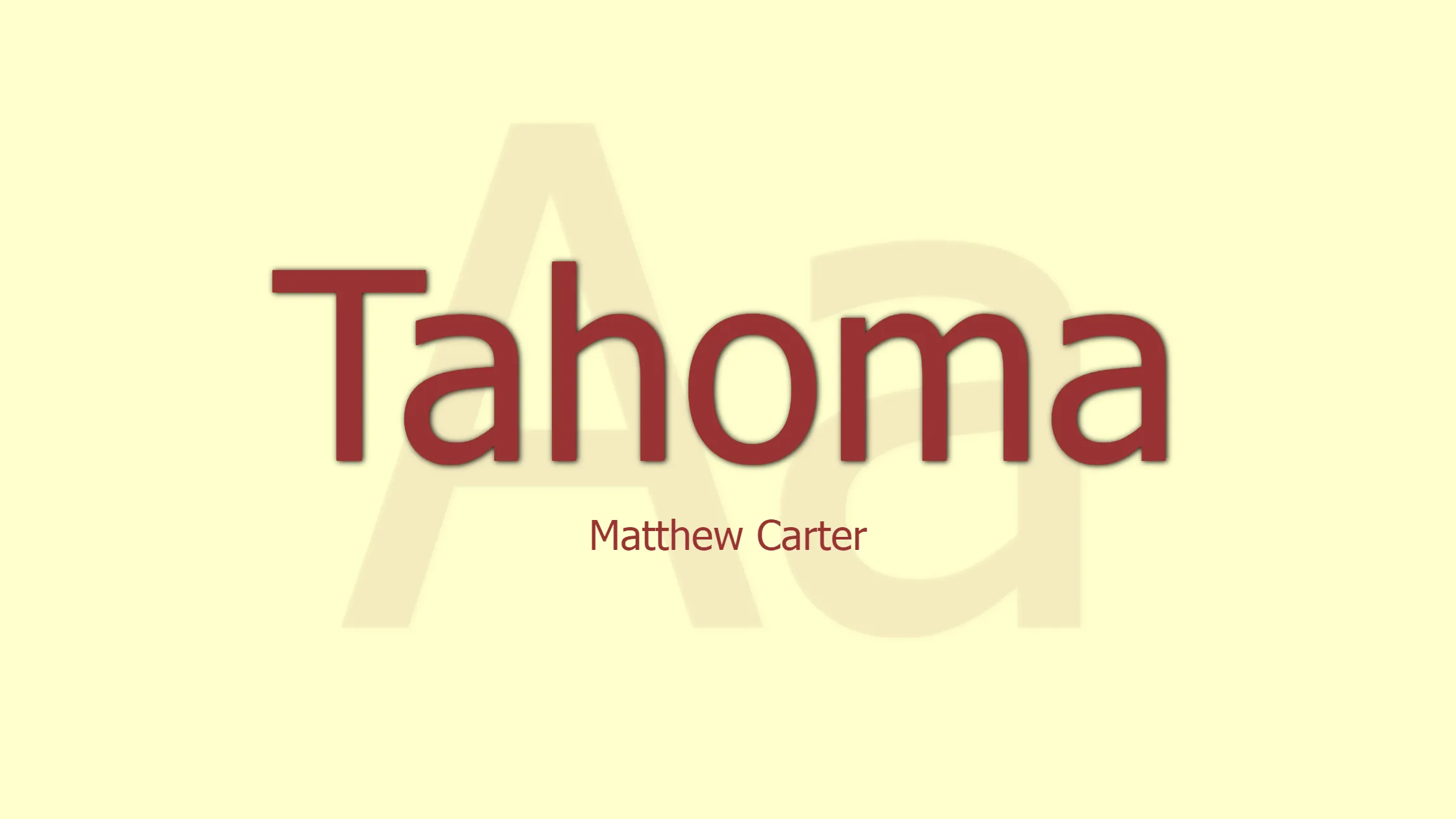

Tahoma is a widely recognized humanist sans-serif typeface that was designed by Matthew Carter for Microsoft Corporation. It made its debut alongside Carter’s other creation, Verdana, as a standard font in the initial release of Windows 95. With its clean and legible design, Tahoma has become a popular choice for both digital and print media. Here, we explore the features and characteristics that make Tahoma a standout typeface:
- Humanist Sans-Serif Design: Tahoma belongs to the humanist sans-serif category, which means it combines modern simplicity with subtle calligraphic influences. This design choice ensures excellent readability, making it suitable for a wide range of applications.
- Designer Extraordinaire: Matthew Carter, a renowned type designer, is the creative mind behind Tahoma. Known for his expertise in creating functional and aesthetically pleasing fonts, Carter’s work has left a lasting impact on the typography industry.
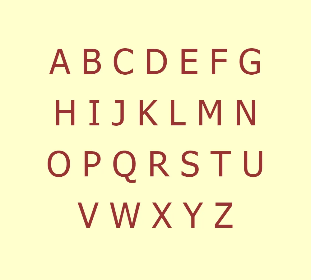
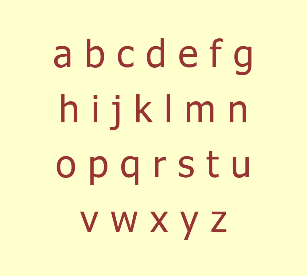
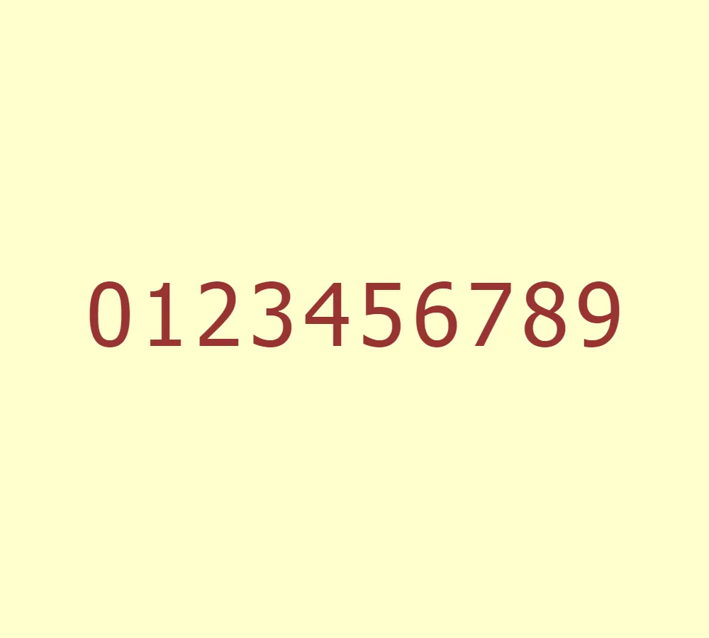
- Clean and Legible: Tahoma’s design prioritizes clarity and legibility, making it an excellent choice for body text and small font sizes. Its well-defined letterforms and consistent stroke widths ensure easy reading, even on screens or in low-resolution environments.
- Versatile Usage: Tahoma’s versatility enables its use across various mediums, including both digital and print media. Whether it’s web pages, presentations, documents, or signage, Tahoma remains readable and visually appealing.
- Enhanced Screen Performance: Tahoma was specifically developed to excel in on-screen environments, particularly in early computer systems. Its carefully designed letterforms and optimized spacing contribute to exceptional readability, even at lower resolutions.
- Geometric Consistency: Tahoma maintains a consistent stroke width and geometric structure across all its characters. This uniformity aids in creating a balanced and harmonious visual appearance while ensuring legibility in different sizes and weights.
- Open Apertures: The open apertures in Tahoma’s letterforms enhance the legibility further, allowing ample space for distinguishing between similarly shaped characters. This characteristic contributes to the typeface’s readability, especially when dealing with condensed or bold variations.
- Extensive Character Set: Tahoma supports a broad range of characters, including Latin, Greek, and Cyrillic scripts. Its extensive character set enables multilingual support, making it a valuable asset for international projects.
- Clear Distinction: Tahoma provides clear distinction between uppercase “I” and lowercase “l,” as well as between the number one “1” and the lowercase “l.” This attention to detail prevents confusion and improves overall readability.
- Personal Use Only: Tahoma is licensed for personal use only. While it is widely available for personal projects, commercial usage requires appropriate licensing to comply with legal restrictions.
With its designer pedigree, exceptional legibility, and versatile applications, Tahoma remains a popular choice for many typographic needs. Its clean and modern design, coupled with Matthew Carter’s expertise, has solidified its place as a reliable and user-friendly typeface. Whether used on digital screens or in printed materials, Tahoma’s clarity and readability continue to make it a go-to option for designers and users alike.


