
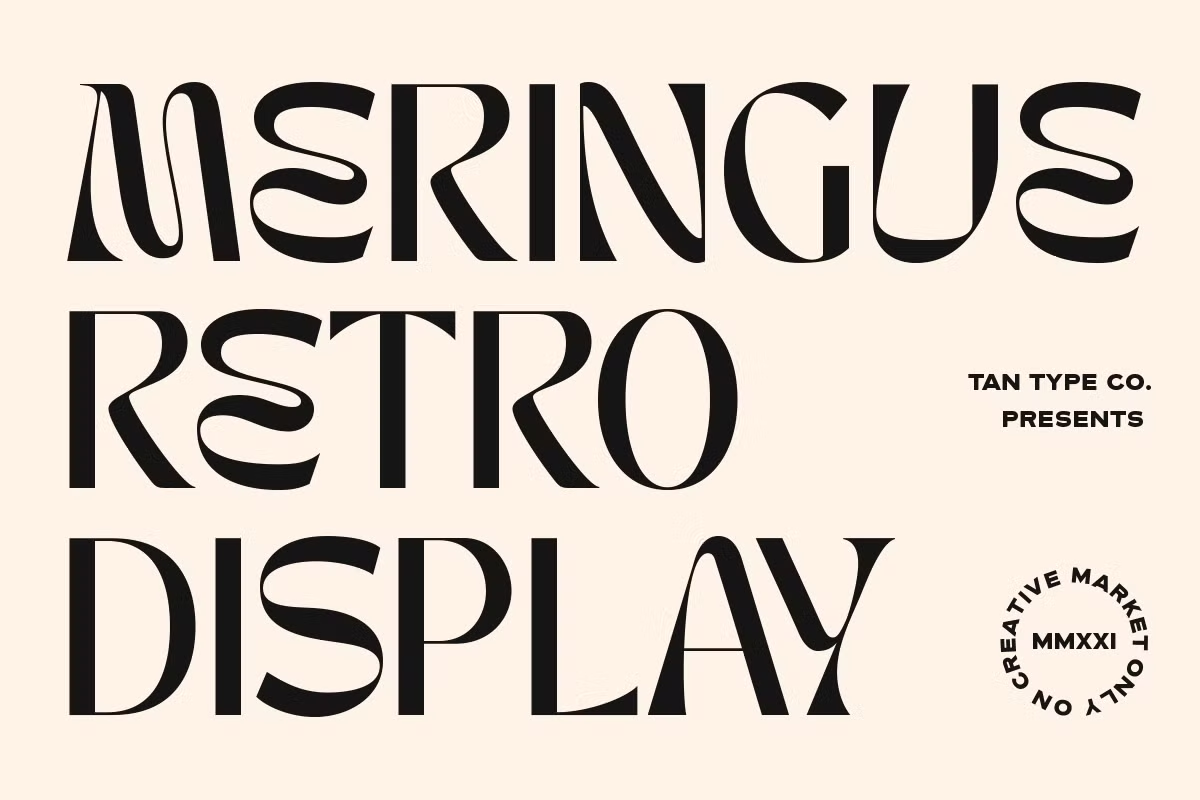

About Tan Meringue Font
I came across the Tan Meringue Font while searching for a soft, playful title style for a small packaging project. The brand needed something friendly but not childish, and most cute fonts I tried felt too messy. This one caught my eye because it looked sweet, but still somewhat controlled and readable.
After some quick tests in mock-ups, I dropped the font into a few layouts for Free Fonts Lab concepts. I tried it on pastel backgrounds, simple icons, and short taglines. It held its charm even when I changed colours and spacing, which made me want to explore it more in real work.
Font Style & Design Analysis
From my experience, this sits firmly in the playful display category. The Tan Meringue Font feels like a soft dessert logo or a cosy café sign. The shapes lean towards a rounded, hand-drawn script vibe, but the structure is clearer than many casual handwritten typefaces. It is not a neutral text font; it is a personality piece meant for headlines and short words.
The designer is unknown to me, and I could not trace a clear foundry source while testing it. That lack of origin does not erase its visual charm, but it does make me more cautious about long-term brand use. When I work with unknown authors, I always keep a backup option ready in case licensing or availability changes later.
Looking closely at the letterforms, you see thick curves, soft terminals, and a bouncy baseline that gives the words a light rhythm. The spacing feels tight by default, which works nicely for logos and labels but can get crowded in longer phrases. The mood is sweet, playful, and relaxed, but it struggles when you push it into dense paragraphs or very small sizes. It shines in short, bold statements and loses clarity when forced into body text.
Where Can You Use Tan Meringue Font?
In real projects, I find this font works best for food, kids, and lifestyle themes. The Tan Meringue Font feels at home on bakery boxes, dessert menus, and cosy café boards. It also fits well on children’s product packaging or playful event posters, where you want a friendly, warm visual identity without feeling too wild or messy.
On screen, the font behaves well at medium and large sizes. Social media graphics, YouTube thumbnails, and hero banners are good spaces for it. When I resized it for story covers and highlight icons, the curves stayed smooth, but I avoided using it below small subtitle size. At that point, the inner shapes start to blur and lose their charm.
Printed pieces like stickers, swing tags, and invitation headers also suit this font style. I would not use it for long paragraphs or detailed infographics, because the heavy curves make blocks of text feel dense. For me, its best role is as a headline accent within a wider font family system, paired with a clean sans-serif or simple serif for supporting copy.
Font License
When I tested the Tan Meringue Font, I treated it as a display option for mock-ups only until I checked the licence. Usage terms can change, especially for fonts with designer unknown, so always review the official licence before using it in commercial projects. For client work, I only move forward once the font rights are clear and documented.
My honest take as Ayan Farabi: I reach for this font when I want something soft, sweet, and expressive for short headlines, but I always pair it with a cleaner workhorse typeface and double-check the licence before it goes into any serious brand system.


Leave a Reply