

About Tan Nimbus Font
My first reaction to the Tan Nimbus Font was simple: it felt bold, rich, and a bit dramatic. I was looking for a strong display typeface for a poster series, and its heavy shapes caught my eye right away. The font looked confident, but still artistic enough for creative work.
I decided to test it on a branding concept for a small coffee shop and a set of social media graphics for Free Fonts Lab. Both projects needed a loud headline voice without looking cheap or messy. Tan Nimbus Font seemed like a good fit for that balance, so I tried it in real layouts.
Font Style & Design Analysis
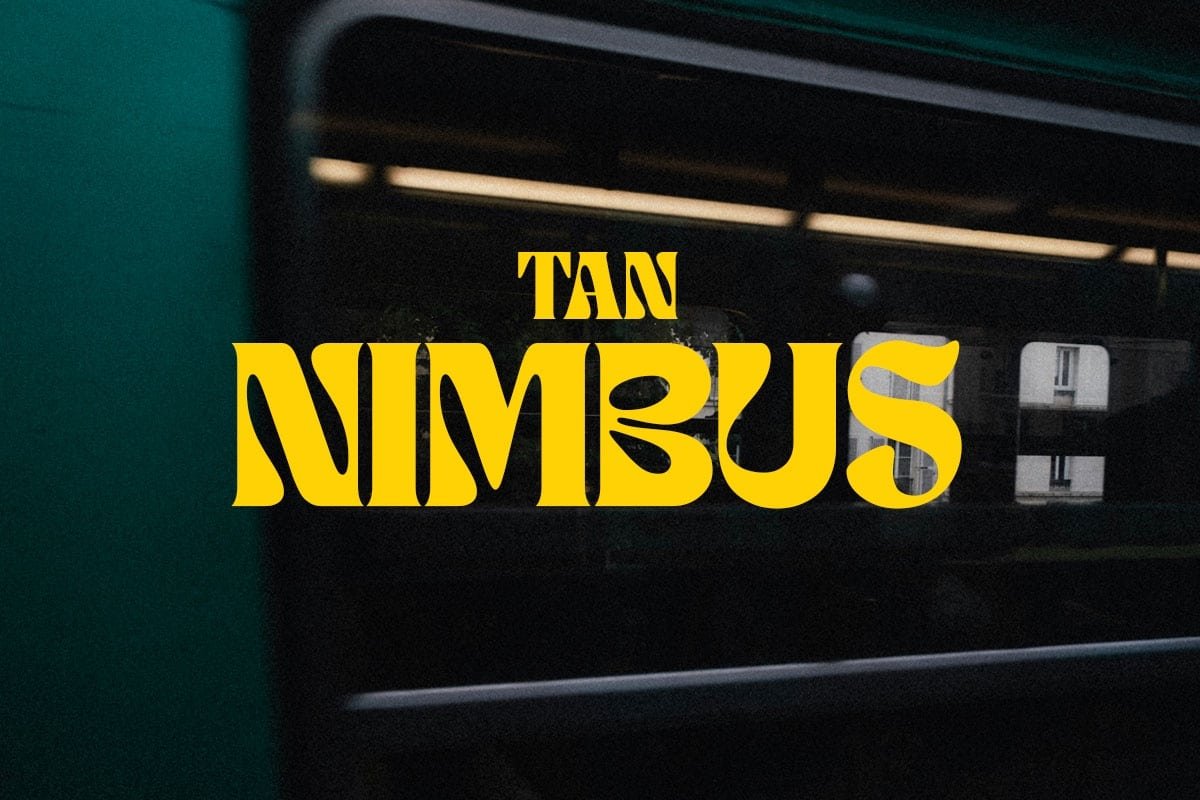
From my experience, this is a display font family with a strong retro and vintage flavour. The letterforms feel wide, chunky, and very deliberate, which makes the font style perfect for big titles and logo marks. It does not try to stay neutral; it wants to be seen and remembered.
The exact creator details are a bit unclear to me, so I treat it as designer unknown for now. I always like to know the mind behind a typeface, but even without that, the design choices speak loudly. You can sense a love for classic poster typography and old sign painting in its shapes.
Looking closely at the letterforms, you see tight spacing, heavy strokes, and sharp interior corners. The rhythm feels dense, almost blocky, which gives every word strong visual weight. This works well for short headlines, but longer text can feel crowded. It shines when you keep words brief and layouts spacious.
Where Can You Use Tan Nimbus Font?
In real projects, I found Tan Nimbus Font best for bold display work. It handles logo ideas, posters, and packaging quite well, especially where a retro mood fits the brand. On large banners and cover images, the thick strokes and dramatic silhouettes stay clear and powerful from a distance.
At smaller sizes, things change a bit. The tight spacing and heavy shapes start to merge, which can hurt readability in long text. I avoid it for body copy or detailed captions. Instead, I pair it with a clean sans-serif typeface for paragraphs, letting Tan Nimbus Font handle only the main titles and key words.
For audiences, it works nicely for lifestyle brands, coffee shops, bars, and creative studios that want a bold visual identity. It also suits album covers, event posters, and statement quotes. When you keep plenty of breathing room around the lettering, the typography feels strong rather than aggressive, which makes layouts more inviting.
Font License
From what I can tell, the licence terms for Tan Nimbus Font may vary depending on the source. I never assume it is free for all uses, especially commercial work. Before using it for client projects or branding, I always check the official licence details and make sure the rights match the planned usage.
My honest takeaway as Ayan Farabi: Tan Nimbus Font is a striking display option when you need loud, retro energy in your designs. It will not solve every typography problem, but if you respect its limits and use it with care, it can give a project a very memorable voice.


Leave a Reply