
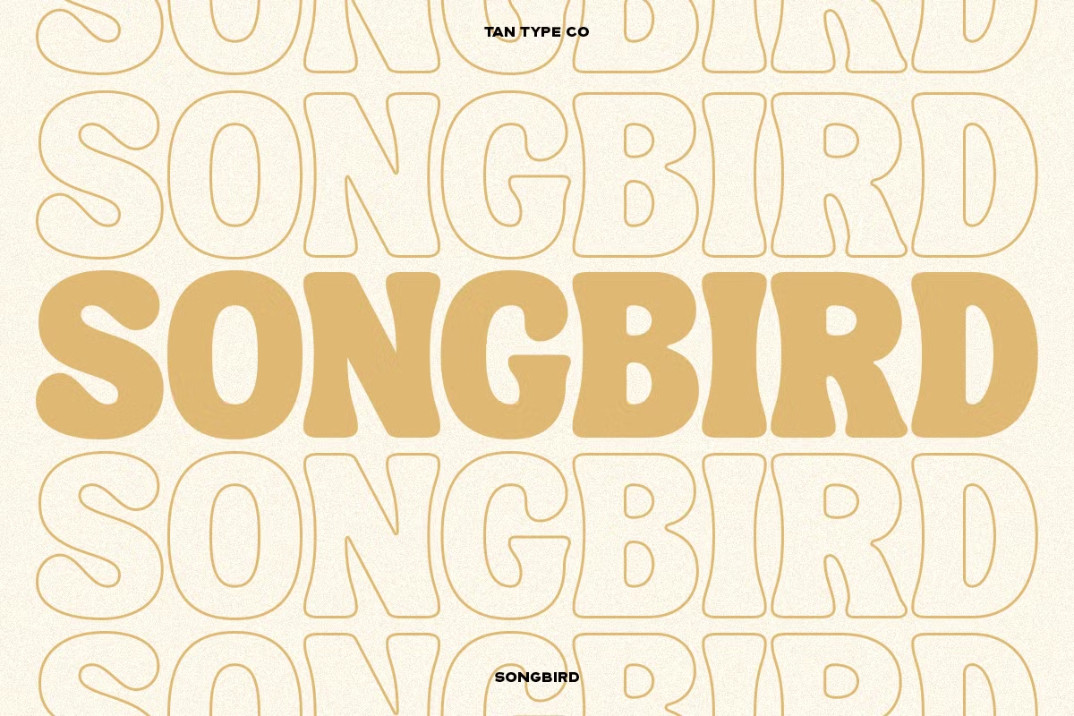

About Tan Songbird Font
I first tried the Tan Songbird Font while working on a bold poster series for an indie music event. I needed a headline style that felt playful, sharp, and slightly dramatic without turning into a cartoon. Tan Songbird caught my eye because its shapes looked stylish but also very readable from a distance.
I tested it across a few layouts for Free Fonts Lab, mixing it with clean body text and simple colour blocks. The font held its own, even on busy backgrounds. What pulled me in was how the letters felt both modern and a little retro at the same time. It promised character without stealing focus from the rest of the design.
Font Style & Design Analysis
The Tan Songbird Font is a pure display typeface, clearly built for impact rather than long reading. It has tight, confident shapes that jump off the page straight away. The heavy strokes and compact forms make it feel strong, while the curves keep it from looking too cold or harsh.
The font comes from the TAN Type foundry, which often explores expressive, high-impact display work. That background shows here. You can sense a clear system in the shapes, not just random flair. The design choices feel deliberate, like each letter was shaped to hold a specific mood.
Looking closely at the letterforms, you notice the firm verticals, sharp joins, and slightly compressed proportions. The spacing is quite tight, which supports the display nature of the font family, especially in large headlines. In small sizes, counters start to feel cramped, so it works best above medium sizes. Its mood leans bold, urban, and stylish, which is great for posters and covers, but less ideal for quiet, minimal brands.
Where Can You Use Tan Songbird Font?
I see the Tan Songbird Font working best in strong headline roles where you want quick attention. Think music posters, fashion lookbooks, film title cards, or bold social media graphics. On a large scale, the typography locks together nicely and creates a tight visual block that reads clearly from far away.
For smaller sizes, like captions or long copy, the heavy shapes and close spacing start to feel dense. I would avoid using it for paragraphs or UI text. Instead, I pair it with a clean sans-serif or a light serif for body copy. This contrast lets Tan Songbird carry the visual identity in titles, while the partner font keeps reading comfortable.
In branding, it suits edgy streetwear, creative studios, events, or lifestyle products aimed at young, design-aware audiences. It also works well in layered layouts, where you stack type, images, and shapes. If you give it breathing room and clear hierarchy, this display font can become a strong anchor without overwhelming the whole design.
Font License
Licensing for the Tan Songbird Font can change depending on where you get it and how you plan to use it. Before using it in client work, products, or commercial projects, always read the current licence terms from the official source. I treat every project as commercial unless the licence clearly says otherwise.
For me, Tan Songbird is a font I reach for when I want confident, stylish impact in a limited number of words. Used with care and good pairing, it can give a project a strong, memorable voice.


Leave a Reply