
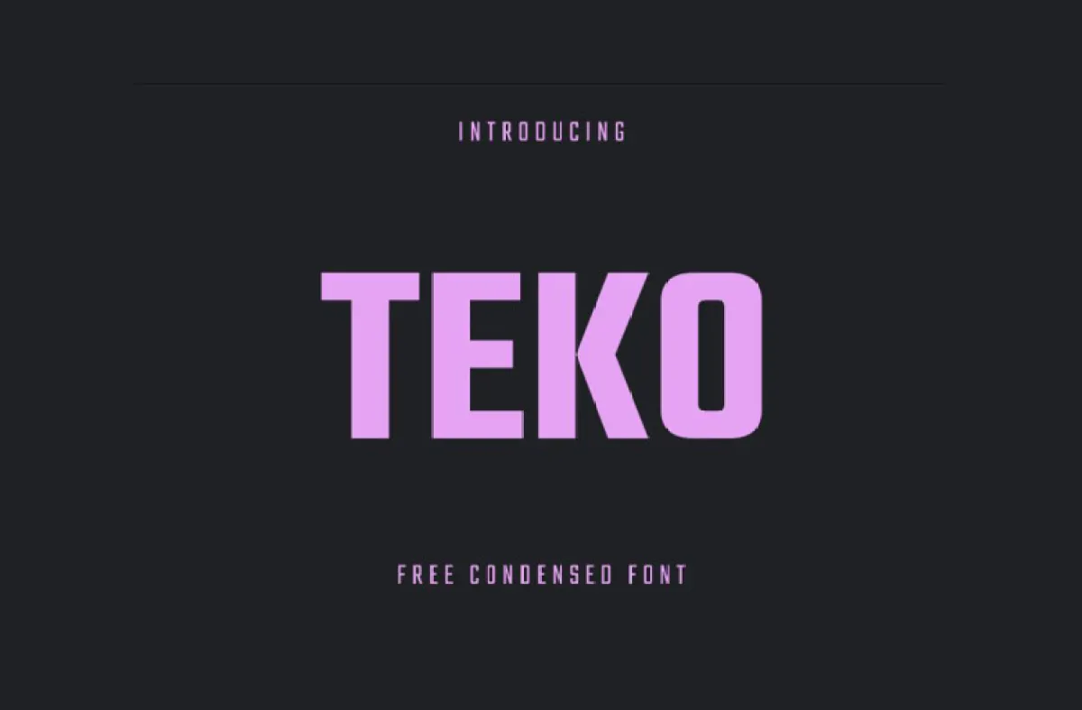

About Teko Font
I first reached for Teko Font while working on a poster for a local gaming event. The layout needed a bold voice, but I still wanted clean, simple shapes that were easy to read from far away. Teko caught my eye because it looked sturdy without feeling messy or loud.
As I tested it in the design, I liked how it held its ground in tight spaces. The tall structure worked well with stacked headlines, and I could push the type quite hard without losing clarity. That first project led me to explore it more deeply, which is why I decided to write about it here for Free Fonts Lab.
Font Style & Design Analysis
Teko Font is a sans-serif typeface with a very compressed and vertical feel. The letters are tall and narrow, almost like they have been squeezed to save space on the line. This gives the font family a strong, compact look that suits bold titles and tight layouts where width is limited.
The font was designed by Indian Type Foundry, and you can feel that sense of modern, urban signage in its style. It reminds me of condensed lettering often seen on sports jerseys and street posters. The typographic voice leans towards strength and clarity, rather than softness or playfulness, which makes it useful for serious and energetic themes.
The letterforms have straight strokes, sharp corners, and almost no decorative detail, which fits its sans-serif nature. The spacing is quite tight by default, so I often add a little tracking when using all caps. The rhythm feels fast and upright, giving headlines a sense of urgency. It works best for short words and phrases; long paragraphs quickly feel heavy and cramped, so I avoid it for body text.
Where Can You Use Teko Font?
In my own work, Teko Font shines in bold headline roles, especially for posters, sports graphics, and event branding. It works well on digital banners where space is narrow but impact matters. When set large, the tall shapes command attention and create a strong visual identity that feels modern and direct.
On small screens, such as mobile interfaces, I use it mostly for headlines or short labels. At very small sizes, the compressed style can look dense, so I pair it with a more open sans-serif for body copy. For example, a neutral typeface beside Teko gives balance and keeps the typography readable while the title still looks powerful.
I would consider Teko Font for e-sports brands, tech events, streetwear graphics, and bold editorial covers. It speaks well to younger, urban audiences who like sharp, confident design. In layout, it works best centred or left-aligned with good breathing space around it. When paired carefully, it can anchor a whole design system with a clear typographic voice.
Font License
From what I have seen, the licence for Teko Font can allow both personal and professional use, but terms may change over time. I always suggest checking the official font source or distributor for the latest licence details before using it in any client or commercial project. For me, it remains a focused, purposeful tool when I need tall, condensed power without noise.


Leave a Reply