
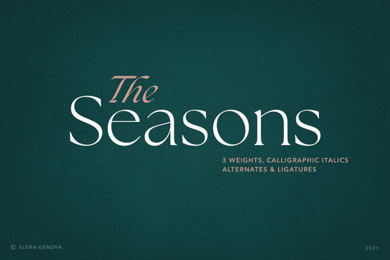

About The Season Font
I came across The Season Font while testing options for a clean winter campaign layout. I needed something calm, modern, and easy to read, but without feeling cold or boring. The Season Font looked like it could balance simplicity and friendliness, so I decided to give it a proper test in a few mockups.
I first tried it in a set of social media posts, then in a basic landing page wireframe. I wanted to see how it handled short headlines, captions, and simple UI labels. For this review on Free Fonts Lab, I focused on how it behaves in real layouts, not just in a specimen sheet.
Font Style & Design Analysis
The Season Font is a sans-serif typeface with a very clean and steady voice. The shapes feel soft but not childish, and the structure stays quite modern. It sits in that space between neutral and friendly, which makes it easy to bend towards many visual identity needs without shouting for attention.
The designer is unknown, at least from the source where I tested it, so I had to judge it only by its behaviour in layouts. That pushed me to look closely at how the font style reacts under different weights, sizes, and background colours. I treated it like any other anonymous but potentially useful font family in my library.
The letterforms are mostly open, with rounded curves and modest contrast, so text feels breathable. Spacing is on the slightly loose side, which helps at small sizes but can look airy in very large headlines. The rhythm stays calm, so it works well for body text in short blocks. As a sans-serif, it favours clarity over character, so it is not ideal when you need a strong, unique display voice. It shines best when you want typography to support the design, not dominate it.
Where Can You Use The Season Font?
I see The Season Font working well in light branding, simple posters, and digital products where clarity matters. It fits lifestyle brands, soft tech products, small cafés, or seasonal campaigns that need a gentle modern tone. In large headlines, it looks clean, but you may need extra tracking control to avoid too much air.
At smaller sizes, such as captions, app menus, or card layouts, the open letterforms help legibility. On screens, the sans-serif structure keeps edges tidy and easy on the eyes. I would feel comfortable using it in mobile UI, onboarding flows, or simple web dashboards where the content is short and scannable.
For pairing, I like putting The Season Font with a more expressive serif for titles, while it handles body text and buttons. It also pairs well with a simple geometric sans for hierarchy contrast, using The Season Font for supporting text. In clean layouts with white space, it gives a soft, approachable base to build around.
Font License
The licence terms for The Season Font can vary depending on where you download it. Before using it in client work or commercial projects, check the official source for clear licence details. I only use it beyond personal tests when I have confirmed rights that match the project scope.
My honest takeaway: The Season Font is a calm, serviceable sans-serif that works best as a supportive voice. I reach for it when I need simple, readable text with a gentle touch, not when I need a standout display hero.


Leave a Reply