

About The Walking Dead Font
I first reached for The Walking Dead Font while building a rough, horror-themed logo for a short film poster. The director wanted something bold, uneasy, and clearly tied to the TV series mood, without feeling like a cheap copy. I needed a logo font that could carry tension on its own.
As I tested it, the heavy, distressed letters gave me a strong base for the main title. It worked well with dark backgrounds and simple layouts. I later wrote this review for Free Fonts Lab after trying the font in a few mock logos and social graphics, just to see how far I could push it.
Font Style & Design Analysis
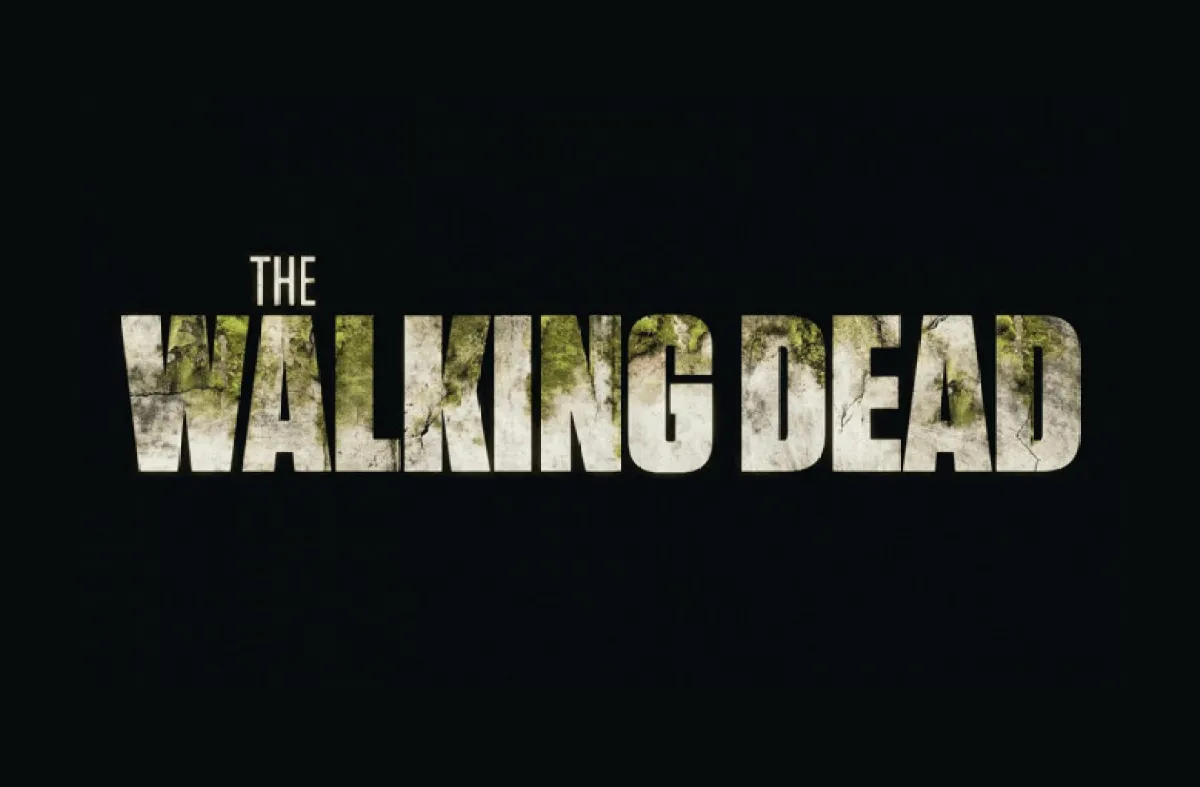
This is a pure logo font, built for bold titles rather than long reading. The shapes are chunky and square, with rough edges that feel scraped or worn. It clearly takes visual cues from the TV show branding, but still works as a general horror or thriller logo typeface when used with care.
The exact creator of this font is designer unknown, which is common with fan-made logo recreations. That lack of clear authorship makes the licensing side more sensitive. From a design view, you can tell it was drawn with the TV series wordmark in mind, focusing on high impact rather than broad typographic flexibility.
The letterforms sit quite tight, with narrow counters and chunky strokes that pull the eye to the centre of each word. The texture adds grit, but also lowers clarity at small sizes. It delivers strong mood: dark, tense, and dramatic. As a logo font, it works best in a few big words; anything longer starts to feel heavy and hard to scan.
Where Can You Use The Walking Dead Font?
I see The Walking Dead Font working best in horror film posters, fan art, and game logos with a survival or zombie theme. It shines when the title is short and bold. At large sizes, the rough texture and thick strokes add character, especially over smoky, dirty, or grunge-style backgrounds.
At smaller sizes, such as body text or captions, the same texture becomes a problem. The gaps and rough edges blur, making letters blend together. I would avoid using this font for paragraphs, UI, or anything that needs quick reading. Instead, I pair it with a clean sans-serif for taglines and supporting text, letting the logo font handle only the main title.
For branding work, I would only choose this font for very niche projects: horror podcasts, Halloween event posters, or themed escape rooms. It sets a strong, specific tone, which is great for mood but risky for broad visual identity use. Used sparingly, it can be the dramatic centrepiece in a wider, more neutral typography system.
Font License
The licensing for The Walking Dead Font is not always clear, especially as it resembles a well-known TV logo. I would never assume free commercial use. Before using it for client work, paid campaigns, or products, I strongly recommend checking the original source and any licence terms in detail.
My honest takeaway as Ayan Farabi: this font is a strong mood tool, best used carefully, in big doses and very small amounts.


Leave a Reply