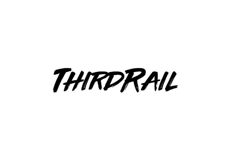
About Third Rail Font
I came across Third Rail Font while searching for a bold, loose script for a poster series. I needed something that felt quick and energetic, but still clear enough for short headlines. Many options looked either too messy or too polished, so this one caught my eye right away.
I tested it on a streetwear-inspired layout for Free Fonts Lab, mixing it with a clean sans-serif. The contrast worked well. The strokes felt lively without looking childish, which is harder to find than it sounds. That balance made me want to push the font further and see how it behaved across different sizes and colours.
Font Style & Design Analysis
Third Rail Font is a script typeface with a loose, marker-style look. The letters feel hand-drawn, as if written fast with a brush pen or thick marker. It leans strongly to the right, which gives the whole font style a sense of motion and attitude. The baseline is not perfectly straight, but it stays controlled enough to keep words readable.
The designer is unknown, at least from all the sources I checked while testing this font family. Because the credit is not clear, I treated it carefully and kept my experiments to mockups and concept work. That is usually what I do when I cannot confirm the original creator before using a typeface in any client project.
The letterforms have wide, sweeping curves, especially on the lowercase a, d, and g. Capitals are large and dramatic, almost like quick signatures. Spacing feels tight by default, which suits posters and logos but can look crowded in long phrases. The rhythm is punchy and irregular, which adds character but reduces comfort for dense text. As a script font, it shines in short bursts: tags, titles, and bold branding marks. It struggles when pushed into small body copy or long sentences.
Where Can You Use Third Rail Font?
I see Third Rail Font working well in projects that need energy and informality. Streetwear brands, music posters, skate or graffiti-influenced graphics all fit its visual identity. At large sizes, the strokes and curves show nicely, and the texture of the script gives designs a strong focal point. It instantly pulls the viewer toward the main word.
On social media graphics or YouTube thumbnails, it can deliver strong, quick impact. I would use it for 2–4 word phrases, not full sentences. When I tried it smaller, especially under 18–20 points, counters began to close up and details blurred. It is better treated like a display script, not a workhorse typeface for paragraphs.
For pairings, I had good results combining this script with a neutral geometric sans-serif or a light, condensed grotesque. The calm supporting font keeps the layout readable while the script carries the personality. I would avoid pairing it with other loud display scripts, as the clash becomes tiring. It suits audiences that enjoy bold, urban-inspired typography: young fashion labels, event promos, and creative personal brands.
Font License
The licensing for Third Rail Font is not always clearly stated, so I would not assume it is free for commercial work. Use it for tests or personal experiments first, then check the official source for current licence terms before using it in any paid or public project. That step has saved me and my clients from trouble many times.
For me as Ayan Farabi, Third Rail Font is a useful option when I need a loud, fast script voice, as long as I keep it short, large, and well-paired.


Leave a Reply