

About Throw Up Font
I came across Throw Up Font while looking for a bold, messy style for a street art poster. I wanted something that felt raw, loud, and a bit playful, without turning into a chaotic mess. This font caught my eye because it balanced that graffiti energy with a clear structure.
I decided to test it on a series of event graphics for a small urban festival. I used it for headlines, short titles, and a few social posts. During those tests, I paid close attention to how the font behaved in different sizes and colours. I later shared my notes with the team at Free Fonts Lab for a deeper review.
Font Style & Design Analysis
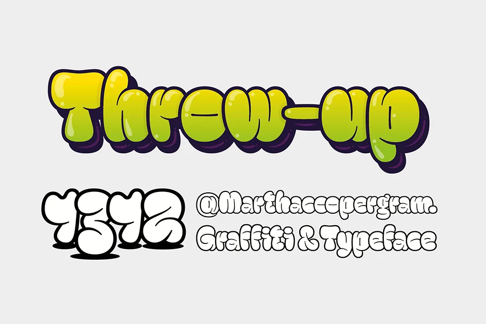
Throw Up Font is a pure display typeface, built to grab attention and set a strong mood. The shapes mimic bubble graffiti tags, with rounded forms and thick strokes that feel fast and confident. The letters look like they were drawn with a fat marker, then cleaned up just enough to stay readable.
The designer is unknown, but the intent feels very clear. It aims to echo street culture, tagging, and quick throw-up graffiti without copying any one artist’s style. The font family looks like it was shaped for posters, album covers, and playful branding, where attitude matters more than polish.
The letterforms are wide, with soft curves and tight counters that create a dense, heavy rhythm. Spacing is slightly tight, which helps the words look like solid blobs of colour. This works well in big titles, but at very small sizes the inner spaces can close up. The mood is bold, cheeky, and a bit rebellious, but not aggressive. As a display font, it shines in short bursts of text and struggles in long paragraphs or detailed body copy.
Where Can You Use Throw Up Font?
I see Throw Up Font working best in youth-focused and urban projects. It suits streetwear logos, event posters, flyers, and album art, especially for hip-hop, rap, or skate culture themes. When used large, the typography feels like a mural headline, with each word becoming a graphic object.
At medium sizes, such as social media graphics or YouTube thumbnails, the font style still holds its character well. You just need to keep text short and direct. For small captions or long lines, it becomes harder to read, so I usually pair it with a simple sans-serif or light serif for body text. That contrast keeps the visual identity clear and easy on the eyes.
In branding, I would use this typeface as a secondary or accent font, not the main workhorse. It works nicely for stickers, badges, and short slogans. When you give it space and strong colour contrast, the letterforms really pop. For more formal or corporate audiences, it will likely feel too playful, but for creative, music, or street projects, it can add a strong, memorable edge.
Font License
Before using Throw Up Font in any client or commercial project, I always check the licence details from the original source. Terms for personal and commercial use can change, so it is safer to confirm what is allowed. I recommend reading the full licence text carefully each time you download or update the font.
For me, Throw Up Font works best as a bold accent tool, not a universal solution. When I use it with care and plenty of breathing room, it adds a fun, streetwise voice that feels honest rather than forced.


Leave a Reply