
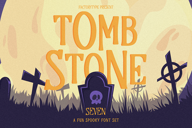

About Tombstone Font
I first picked up Tombstone Font while building a spooky event poster for a local theatre group. They wanted something bold, a bit creepy, but not childish. I had a folder full of horror fonts, yet nothing felt quite right for their mix of drama and fun.
While exploring options for Free Fonts Lab, this typeface caught my eye because of its carved, almost graveyard-like mood. I tested it on headers, title cards, and a few mock social posts. The font family gave me a clear, strong voice that still left room for supporting typography to breathe around it.
Font Style & Design Analysis
This is a pure halloween display typeface, and it leans fully into that spooky theme. The letters feel like they were cut into stone, with chunky shapes and sharp edges. You get an instant sense of old cemeteries, ghost stories, and classic horror posters. It communicates fear and fun at the same time.
The designer is designer unknown, which happens with many themed halloween fonts. Even so, the design choices show a clear idea. The font style is focused on mood first, readability second, which suits seasonal and event-based work. It feels like something drawn for posters, not for long reading.
The letterforms have strong vertical strokes and slightly uneven details that create a rough, carved texture. Spacing is fairly tight, especially in uppercase, so words form dense, heavy blocks. This helps headlines feel powerful, but it also means you need space around the text. The rhythm is bold and slow, not suited for fast scanning or small captions. It shines in short phrases, logotypes, and halloween wordmarks, but struggles in body copy or detailed interface work.
Where Can You Use Tombstone Font?
I see Tombstone Font working best in seasonal graphics and halloween branding. Think haunted house posters, party flyers, escape room visuals, or themed school events. At large sizes, its irregular cuts and stone-like edges become very clear and add character. On digital banners and thumbnails, it still holds up well when used as the main headline.
At smaller sizes, the rough details start to close up, and counters can feel cramped. For that reason, I avoid it for paragraphs, menus, or any dense copy. I usually pair it with a clean sans-serif or a simple serif for body text. This balance keeps the layout readable while letting the halloween display font do the emotional heavy lifting.
For branding, it can support logos for horror podcasts, indie games, seasonal shops, or themed food trucks. It speaks to audiences who enjoy gothic, campy, or retro horror styles. When you set it with generous letter spacing and clear margins, it looks intentional and designed, not just a random spooky font dropped into a layout.
Font License
Before using Tombstone Font in any project, especially client or commercial work, always review the licence from the original source. Terms for personal and commercial use can change, and I never assume a font is free to use everywhere. A quick check saves legal trouble and shows respect for the creator.
For me, Tombstone Font is a strong, reliable choice when I need a focused halloween mood without overcomplicating the design.


Leave a Reply