
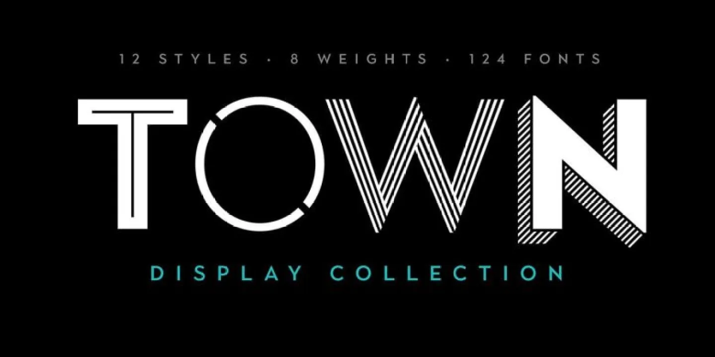

About Town Font
I came across Town Font while comparing bold title options for a poster job. I needed something loud, clear, and a bit playful, but not childish. Many display fonts felt too heavy or too quirky, so I kept scrolling until this one caught my eye.
What pulled me in was its strong shape and simple rhythm. It had presence without shouting at you. I tested it on a music event layout for Free Fonts Lab and then dropped it into a mock brand board. That quick test showed me it could carry headlines and logos without getting in the way of the rest of the design.
Font Style & Design Analysis
Town Font is a display typeface with a clear, blocky structure that wants attention. The letters sit solid on the line, with forms that feel direct and confident. It has a modern look, but there is a slight softness in the curves that keeps it from feeling too cold or mechanical.
The designer is unknown, at least from the sources I checked while testing it. That said, the font family feels considered. The weight and shapes suggest someone who understands basic typography rules, even if they kept the style quite simple. Nothing feels random or rushed, which matters a lot for a display font you want to trust in client work.
The letterforms lean on straight stems and generous counters, so words read quickly at larger sizes. Spacing is fairly tight by default, which helps headlines feel compact and strong. I sometimes loosen the tracking a bit for wider layouts. The mood is assertive but not aggressive. It works well for short bursts of text, but in long lines the rhythm can feel dense, so I avoid using it for body copy or long captions.
Where Can You Use Town Font?
Town Font works best where you need bold impact in a few words. I found it useful for posters, banners, and social graphics where the message must be seen from a distance. On screen, at large sizes, the shapes stay crisp and easy to read, which suits event promos and announcement slides.
On smaller sizes, like captions or interface labels, the display nature of the font starts to feel cramped. The tight spacing and heavy forms can reduce clarity. I usually keep it for headlines, subheads, or short taglines, then pair it with a clean sans-serif or serif for the main reading text. That mix gives balance to the visual identity.
Branding-wise, I would use this font for music, sports, gaming, or youth-focused projects that want a firm but friendly voice. It can also work in logos when you want blocky letters that hold up in simple layouts. A softer supporting typeface and enough white space help stop Town Font from taking over the whole page.
Font License
I could not confirm a single fixed licence for Town Font, so I always treat it with care. Before using it in paid client work or large campaigns, check the original source for clear licence details. For personal or experimental use, I still read the terms to stay on the safe side as a designer.
For me, Town Font has become a solid option when I need a straightforward, punchy headline face without too much drama. I reach for it when I want strength and clarity, but I am careful to keep it away from long reading text.


Leave a Reply