

About Tt Bluescreens Font
I came across Tt Bluescreens Font while comparing several modern options for a clean tech landing page. I needed a typeface that felt digital, but not cold or harsh. Something that could handle both bold headlines and simple body text without feeling bland.
The straight, tidy shapes caught my eye first. The font looked confident, but still friendly enough for everyday users. I decided to test it more deeply for a Free Fonts Lab mock project, just to see how it behaved in a full layout, not only in a quick preview window.
During those tests, I paid close attention to how it worked with colour, icons, and dense UI elements. That process gave me a clear sense of its strengths and where it starts to struggle.
Font Style & Design Analysis
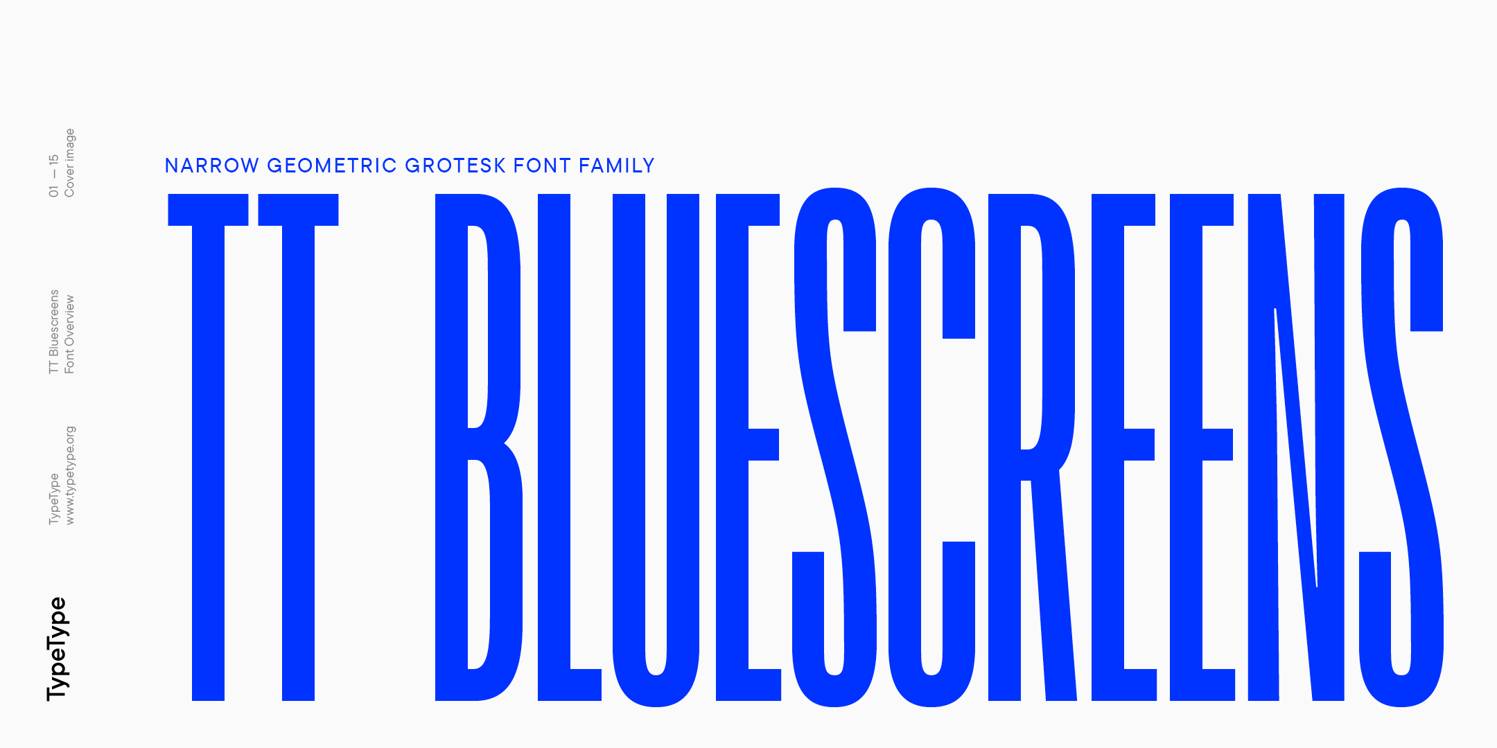
Tt Bluesscreens Font is a sans-serif font family with a clear geometric base. The shapes lean towards straight lines and clean curves, which gives the typeface a structured, screen-first feeling. It looks like it was shaped with user interfaces, dashboards, and modern digital products in mind.
The designer is unknown, at least from the material I could access. Because of that, I treated the font as a neutral tool, not a statement piece from a famous foundry. That mindset helped me judge it only by how it performs in layout, rather than by name recognition or branding story.
The letterforms have low contrast and a steady rhythm, which keeps reading calm and predictable. Spacing feels slightly tight at larger sizes, but it works well for headers once you add a little tracking. At small sizes, the counters stay open enough, though long paragraphs can look a bit dense. The mood sits between functional and techy, so it shines in product screens, but it is less suited to warm, emotional storytelling. As a sans-serif, it offers clarity and structure, but it will not carry a highly expressive visual identity on its own.
Where Can You Use Tt Bluesscreens Font?
Tt Bluesscreens Font fits best in digital products, tech brands, and clean corporate decks. In large sizes, it delivers sharp, easy-to-scan headlines for landing pages, app screens, and dashboards. It feels at home in layouts that rely on grids, icons, and charts, where clarity matters more than decorative style.
In smaller text, the font stays readable, but I would not choose it for long-form editorial work. Short paragraphs, UI labels, menus, and cards feel balanced and controlled. For design systems, this sans-serif works well as the primary UI font, especially when you keep line height generous and avoid very tight columns.
For pairing, I had good results using this typeface for body and UI, with a more expressive display font for titles or hero text. It also pairs nicely with a subtle serif for quotes or highlights, adding a bit of contrast to the clean base. For brands, I would use Tt Bluesscreens Font in tech, fintech, SaaS, dashboards, and education platforms aimed at young adults and professionals.
Font License
The licensing terms for Tt Bluesscreens Font can change, and different sites may offer different permissions. Before using it in any personal or commercial project, always read the official licence details from the original source. I recommend double-checking usage rights for apps, web embedding, and client work every time.
For me, Tt Bluesscreens Font is a solid, practical choice when I need clean digital clarity, not personality fireworks. Used with care, it does its job quietly and well.


Leave a Reply