
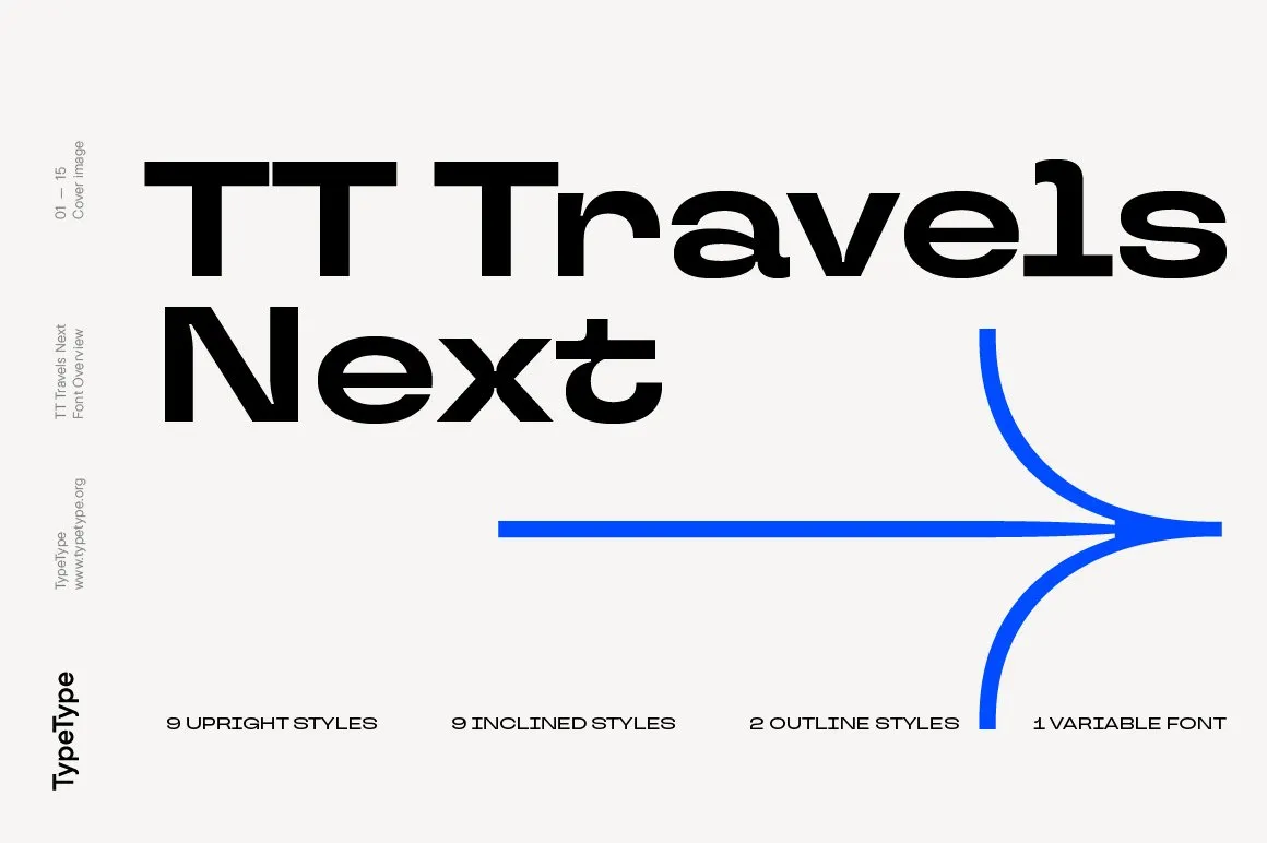

About Tt Travels Font
I first picked up Tt Travels Font while working on a travel app concept. I needed something clean, modern, and calm that would still feel human and warm. Many popular geometric fonts felt too sharp or cold for that project, so I went looking for a softer option.
The shapes of this typeface caught my eye straight away. It looked like a modern transport sign system, but with a more friendly voice. I decided to test it across the whole interface, from large headlines to tiny labels, and later wrote about that process for Free Fonts Lab.
Font Style & Design Analysis
Tt Travels Font is a sans-serif typeface with a clear, contemporary focus. The design leans towards geometric shapes, but it does not feel strictly mechanical. Curves look smooth, joins are tidy, and the whole font family has a quiet, organised energy that works well in structured layouts.
The official release credits the work to the TypeType foundry, so this is not a casual side project. That shows in the range of styles, the careful spacing, and the general polish of the font family. It feels like a system typeface built for signage, brands, and digital products.
The letterforms have wide counters, fairly low contrast, and a steady rhythm from line to line. Spacing is generous by default, which gives text a relaxed pace and good clarity on screens. In long paragraphs, the sans-serif structure stays readable, though it can look a bit spacious if you do not tweak tracking. It shines most in headings, UI labels, wayfinding, and any layout that needs order without stiffness.
Where Can You Use Tt Travels Font?
I found Tt Travels Font especially strong in digital interfaces. Large headings on landing pages look confident and easy to scan. In app UI work, the clear shapes help with quick reading, even on small mobile screens. For navigation labels and buttons, the open counters make tap targets feel simple and approachable.
In print, this font suits editorial layouts, city guides, maps, posters, and transport style graphics. At big sizes, the geometric feel becomes more noticeable and gives a strong visual identity. At small sizes, it still holds up, but I often tighten tracking a bit to keep lines steady and compact.
Branding is another good fit. For tech, travel, or logistics brands, this font family can act as a solid core typeface. I like pairing it with a softer serif for body copy, or with a bold display face for hero titles. When used with plenty of white space and a clear grid, Tt Travels Font helps layouts feel planned, organised, and trustworthy.
Font License
The licence for Tt Travels Font can differ by source and package. Some styles may allow personal testing, while wider commercial use often needs a paid licence. Before you use it in client work or large projects, always check the latest terms from the official foundry or distributor.
For me, this typeface works best when I want structure, clarity, and a calm voice in one place. Used with intention and enough space, it becomes a reliable tool rather than a loud trend piece.


Leave a Reply