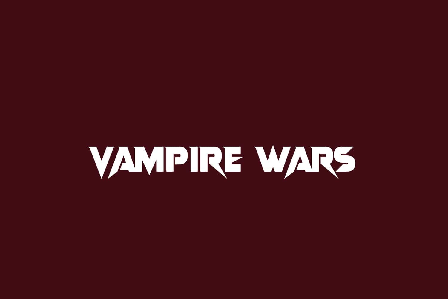
About Vampire Wars Font
I first reached for the Vampire Wars Font while working on a dark fantasy poster that needed a bold title. The client wanted something dramatic, sharp, and a little theatrical, without looking cheap or messy. I was hunting through my horror and fantasy folder and this typeface kept catching my eye.
What drew me in was its balance between gothic flavour and pop culture energy. It felt like a movie logo, but still usable in layout work. I tested it across a few concepts for Free Fonts Lab, mainly for headings and logos. That quick test turned into a longer trial, because I wanted to see how far I could push it.
Font Style & Design Analysis
Vampire Wars Font is a display typeface made for dramatic, attention-grabbing titles. The design leans into horror and fantasy, with sharp edges and bold strokes that suggest claws or blades. The shapes sit somewhere between gothic and comic-book drama, which gives the font a very cinematic presence on the page.
The designer of this font is unknown, at least from the sources I could verify. That happens quite often with niche horror and fantasy display fonts. Because of that, I always treat it more like a stylistic tool than a core brand typeface. Without clear foundry details, I use it mainly for short, high-impact text rather than full identity systems.
The letterforms have strong vertical tension and slightly compressed proportions, which makes words look tight and energetic. Spacing is fairly even, but some pairs need manual kerning, especially in all-caps settings. The rhythm feels punchy, not refined, which suits posters, YouTube thumbnails, and game titles. As a display font, it works best in large sizes; at small sizes, the sharp details can clump and lose clarity.
Where Can You Use Vampire Wars Font?
I find Vampire Wars Font most useful in horror, fantasy, and action themes where drama matters more than subtlety. It shines on movie-style posters, book covers, and game splash screens. When you set it large, the jagged edges and heavy strokes create a strong visual identity that feels loud and confident.
For digital work, it works well in thumbnails, banners, and hero images, especially for streaming channels, RPG content, or Halloween promotions. I would avoid it for UI, body copy, or anything that needs calm reading. In small sizes, the details close up, and the typography starts to feel muddy, so I keep it for main titles and short taglines only.
When pairing it, I usually match this display font with a clean sans-serif or a simple serif for body text. The contrast keeps layouts readable and stops the design from feeling noisy. I like to give the letters plenty of breathing space in the layout, using generous margins and simple backgrounds, so the aggressive shapes can stand out without fighting other elements.
Font License
The licence for Vampire Wars Font can vary depending on where you download it. Some sources may allow personal use only, while others might permit commercial projects. I always recommend checking the original licence text from the official source before using it in any paid or client work. That small step avoids messy issues later.
For me, this font is a fun, focused tool: great when I need loud horror-fantasy energy, but not something I reach for every day. When used with care, it can anchor a striking title and give a project a bold, cinematic edge.


Leave a Reply