
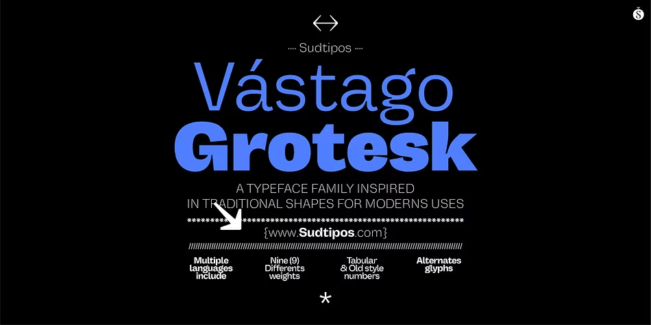

About Vastago Grotesk Font
I came across Vastago Grotesk Font while working on a clean rebrand for a small tech studio. They wanted something modern, but not cold or trendy for just one season. I needed a typeface that felt stable, simple, and honest on both screen and print.
The strong, even shapes of this font family caught my eye first. It looked neutral at a distance, yet had just enough character up close to stay interesting. I tested it in a full identity mock-up for the client and later decided to explore it deeper for Free Fonts Lab, mainly to see how far I could push it.
Font Style & Design Analysis
Vastago Grotesk Font is a sans-serif typeface with a clear, rational design. The overall direction feels functional and measured, very much in the grotesk tradition. Strokes are fairly even, counters are open, and the shapes aim for clarity rather than drama. It leans more workhorse than showpiece, which is often exactly what good typography needs.
The foundry credits list the designer unknown, which leaves the typeface to speak for itself. There is no loud branding story behind it, and that actually suits the design. It feels like a tool built for everyday use, not a statement piece chasing attention. That neutrality becomes one of its strongest assets in real projects.
Looking closely at the letterforms, the rhythm is steady and predictable in a good way. The spacing is slightly tight by default, which works well for headlines but may need a touch of tracking for long text. The curves on letters like “a” and “e” are simple and open, giving a calm mood. Its sans-serif structure keeps things clean, but if you need strong personality or warmth, you may want a companion font style for accents.
Where Can You Use Vastago Grotesk Font?
I found Vastago Grotesk Font very dependable in branding work, especially for tech, agencies, and product design studios. It handles logos with short names, wordmarks, and basic monograms without falling apart. On large layouts like posters, the even weight and simple geometry hold up nicely and keep the visual identity stable.
On screens, this sans-serif font family performs well in UI elements, navigation, and app headings. At medium sizes, it stays crisp and readable, even on lower-resolution displays. For small body text, it is usable, but I did need to open the line spacing a little to avoid a dense feel. It is better suited to short paragraphs than long editorial pages.
In terms of pairing, I like using this typeface with a softer serif for longer copy blocks, or with a more expressive display style for hero titles. Vastago Grotesk Font can sit quietly in the system, handling captions, buttons, and forms while another font carries emotional weight. Used this way, its calm, neutral voice supports many different audiences and project types.
Font License
Before using Vastago Grotesk Font in client or commercial work, I always check the current licence details from the official source. Terms for personal and commercial use can change over time, so it is safer to read the licence carefully and keep a record for each project.
My main takeaway as a designer is simple: this is a quiet, reliable sans-serif that works best as a solid base, not a star. When I need typography to support the design rather than dominate it, I happily keep this font in mind.


Leave a Reply