

About Venom Font
I ran into Venom Font while working on a bold logo concept for a gaming channel. The client wanted something sharp, loud, and a bit dangerous, but still readable at a glance. I was searching through strong, edgy options when this typeface stood out right away.
The heavy shapes, sharp cuts, and aggressive energy felt perfect for a striking mark. I decided to test it in a few quick mockups, including dark thumbnails and banner layouts. It handled that intense, high-contrast look very well. Later, I explored it more deeply for a Free Fonts Lab review, to see where it truly works and where it starts to struggle.
Font Style & Design Analysis
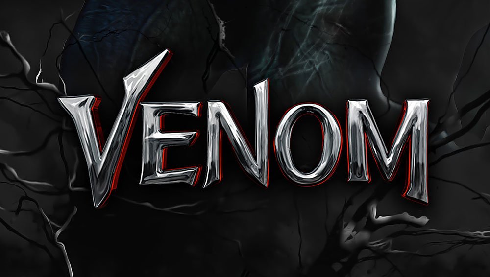
This is a pure logo typeface, built for impact first and reading second. The design leans into sharp, claw-like angles and thick strokes, which give it a strong comic and action-horror flavour. It clearly aims to echo the mood of the Venom character and similar dark hero aesthetics, so it feels very theme-driven.
As far as authorship goes, the designer unknown label applies here, since credit is not clearly shown in many font files shared online. That lack of clear origin sometimes means small inconsistencies in production quality. Still, from a practical design point of view, the idea is focused and quite usable if you treat it as a specialist display tool, not a general-purpose font family.
The letterforms use heavy contrast between thick masses and razor edges, which creates a jagged rhythm across words. Spacing is fairly tight, especially in capitals, so I often add a bit of tracking for clarity. The mood is loud, aggressive, and slightly chaotic, which works well for action titles but can feel messy in long text. Its strength lies in short, punchy words; anything longer starts to lose clarity.
Where Can You Use Venom Font?
In my tests, this logo font performed best in large sizes, such as wordmarks, esports branding, and movie-style titles. When you blow it up, all the cuts and spikes become clear, and the dangerous vibe really comes through. It works nicely on posters, streaming overlays, merch graphics, and bold event titles that want a dark, comic-book edge.
At medium sizes, like YouTube thumbnails or social media headers, Venom Font still holds up if you keep the text short. Two or three words feel safe. Anything like taglines or long names gets hard to read, especially over busy backgrounds. I usually pair it with a clean sans-serif for supporting text, so the main logo shouts while the rest stays simple and quiet.
In small sizes, such as body copy, navigation labels, or app UI, it fails quickly, which is expected for this kind of typography. It is not meant for paragraphs or long reading. I see it working best for audiences into gaming, metal music, horror, thriller, or superhero content. Used sparingly, as a headline punch, the font style can give a project a clear, dramatic visual identity without taking over everything.
Font License
The licence for Venom Font can vary depending on where you download it, so it is important not to guess. Always read the licence text from the original source before using it in paid client work. I recommend checking both personal and commercial terms carefully, especially for logos and merchandise.
My main takeaway as Ayan Farabi: treat this font as a sharp tool for bold, themed logos and titles, and use it with control. When you give it space and pair it with something calmer, it can add real edge without hurting readability.


Leave a Reply