

About Vermin Vibes Font
I first tried the Vermin Vibes Font while working on a noisy, glitchy poster for a music event. The brief asked for something messy, aggressive, and a bit chaotic, but still readable. Many clean typefaces felt too safe, so I went hunting for something rougher and more disruptive.
When I found this font, the harsh angles and broken shapes caught my eye right away. It looked like digital decay, but with a clear structure underneath. I tested it in a few layouts for Free Fonts Lab, then dropped it into my poster grid to see how it reacted with strong colour blocks and textures.
What kept me interested was how it held its own against loud graphics. The font did not disappear into the background. It pushed back, which was exactly what I needed for that project.
Font Style & Design Analysis
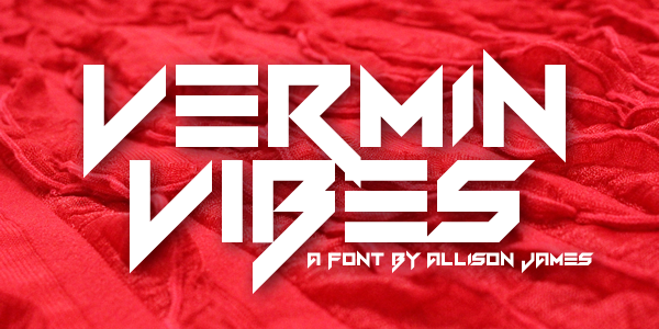
The Vermin Vibes Font is a pure display typeface, built for impact rather than quiet reading. Each letter feels like it has been sliced or glitched, with sharp cuts and irregular shapes. The font style leans heavily into a digital, underground look, suited to bold, confrontational layouts.
The designer is unknown, but the intent feels very clear. This font family seems aimed at fans of distorted techno, metal, or cyberpunk visuals. It reminds me of worn-out screens, damaged signals, and harsh electronic textures. Whoever created it cared more about energy and attitude than about smooth polish or neutrality.
The letterforms are wide, jagged, and tightly packed, with little breathing room between characters. This creates a dense rhythm, almost like a wall of visual noise. In large sizes, the broken shapes become strong graphic elements. In small sizes, the details merge and can hurt legibility. As a display font, it works best for short words, titles, and logos, not body text or UI labels.
Where Can You Use Vermin Vibes Font?
I find the Vermin Vibes Font most useful in projects that want to feel raw, loud, and slightly hostile. Think album covers, rave flyers, underground festival posters, or horror and sci-fi titles. It shines when the visual identity needs to signal chaos, rebellion, or digital decay from the first glance.
At large sizes, this display typeface becomes almost like illustration. You can stack it, repeat it, or overlay textures without losing the core shapes. In smaller text, though, it starts to blur and lose clarity, so I avoid long headlines or dense paragraphs. For body copy, I always pair it with a simple sans-serif or a stable serif.
In terms of pairing, I like to contrast its broken letterforms with very clean, geometric fonts. That balance lets the eye rest while still keeping the edge. It works well on dark backgrounds, neon colour palettes, grunge textures, and glitch graphics. If your audience expects calm, formal branding, this is the wrong choice. If they love noise, it will feel right at home.
Font License
Before using the Vermin Vibes Font in client work or commercial projects, I always double-check the licence terms from the original source. Some versions allow free personal use but limit commercial use or redistribution. If you plan to use it for paid work, make sure you read the latest licence details carefully.
For me, this font is a sharp tool, not a daily driver. When a project needs that rough digital edge, it does the job with strong personality. Used in the right place and in the right amount, it can turn a simple layout into something bold and memorable.


Leave a Reply