
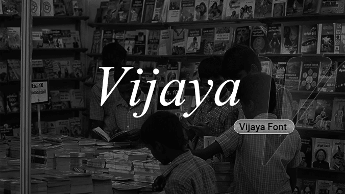

About Vijaya Font
I first reached for Vijaya Font while working on a quiet editorial layout that needed a calm, readable voice. The project mixed English with South Asian context, so I wanted a serif that did not feel cold or overly formal. Vijaya looked like it could sit between traditional print and a more neutral digital style.
What kept me testing it was the balance between its soft curves and fairly sharp serifs. It felt familiar, almost like a book face, yet still slightly different from the usual choices we see everywhere. For a review on Free Fonts Lab, I spent time using it in headings, long text, and a few mock branding pieces to see how it behaved in real layouts.
Font Style & Design Analysis
Vijaya Font is a serif typeface with a gentle, book-like tone. The letterforms feel rooted in classic print design, with moderate contrast between thick and thin strokes. The overall texture on the page is calm and steady, which suits long reading. It does not shout; it speaks in a low, steady voice.
The exact designer is unknown, which makes it harder to place within a clear design tradition. Still, the font family feels influenced by traditional text faces used in printed books and newspapers. You can sense a focus on legibility first, style second. It seems built more for everyday reading than for dramatic display uses.
Looking closely, the letterforms have fairly open counters and slightly rounded curves, so words feel comfortable and approachable. Spacing is on the loose side, which helps at small sizes but can feel airy in large headlines. The rhythm is even, with no sudden shapes that pull the eye away. Its strengths lie in body text, reports, and simple editorial work. For logos or very bold branding, its quiet mood and modest detail can feel too reserved.
Where Can You Use Vijaya Font?
I see Vijaya Font working best in projects that value clarity and a calm reading experience. Reports, school documents, NGO publications, and basic corporate templates all benefit from its steady serif voice. At small sizes, on screen or on paper, it stays readable and does not break apart, which is key for long paragraphs.
At larger sizes, like posters or hero headlines, its softness can become more visible. In those cases, I usually pair it with a clean sans-serif for contrast. A simple geometric sans for headings, with Vijaya handling the body copy, creates a clear visual hierarchy. This mix keeps layouts modern while still grounded in traditional typography.
For audiences who read a lot—students, researchers, office teams—its serif structure supports focused reading without visual noise. It also suits bilingual or regional documents where you want a neutral typographic base. I would avoid it for high-fashion branding, bold tech identities, or highly expressive layouts, as its tone is more practical than dramatic.
Font License
The licensing for Vijaya Font can vary depending on the source where you get it. Before using it in commercial work, always check the official licence terms and any platform notes. For personal experiments or internal mock-ups, I still make sure the usage fits within the allowed rights.
For me, Vijaya is a dependable, low-profile serif that works when I need quiet clarity rather than personality. I reach for it when the content should lead and the typography should simply support.


Leave a Reply