
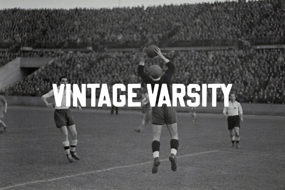

About Vintage Varsity Font
I first picked up Vintage Varsity Font for a sports poster job where the client wanted something bold, fun, and a bit nostalgic. The name instantly reminded me of stitched letters on old college jackets, so I was curious to see if the font carried that same energy on screen and in print.
What kept me interested was how it promised a classic team look without feeling overly serious or strict. I tested it on mock jerseys, social graphics, and a simple logo idea for a school club feature on Free Fonts Lab. Each test helped me understand how flexible it really is.
Font Style & Design Analysis
From a design point of view, this is a strong display typeface built for attention and impact. The style leans into retro sports typography, with chunky shapes that feel right at home on banners, badges, and bold headlines. It sits clearly in the varsity and athletic category, made for big, confident words.
The exact creator details are not always stated in every source I checked, so I treat it as designer unknown when sharing notes with clients. That said, the work feels thought through, not rushed, and suggests someone with a solid eye for classic American school lettering and vintage sign painting.
Looking closely at the letterforms, you get blocky strokes, sharp corners, and firm edges that give the font real weight. Spacing is fairly tight, so words lock together like a team, which adds rhythm and unity to a layout. It shines in short headlines, initials, and numbers, but long paragraphs feel heavy and tiring, so I avoid using it as a text font.
Where Can You Use Vintage Varsity Font?
On real projects, I have found Vintage Varsity Font works best in large sizes where every edge and angle can breathe. Sports posters, event tickets, and match-day programmes all benefit from its bold voice. It also feels right on youth club branding, college-themed campaigns, and game night graphics.
When I scale it down for smaller captions or menu labels, the details start to cram together and lose clarity, especially on low-resolution screens. For that reason, I pair it with a clean sans-serif font family for body copy, and let Vintage Varsity Font handle only titles, section headers, or jersey numbers that need a loud, clear punch.
Student groups, athletics brands, e-sports teams, and retro clothing lines can all use this style to build a strong visual identity. It communicates energy, team spirit, and a bit of old-school charm. In layouts, I like using plenty of negative space around it, sometimes adding simple lines or badges so the chunky forms stay readable and don’t overwhelm the page.
Font License
From what I have seen, the licence terms for Vintage Varsity Font can vary between sources, especially for commercial projects. Personal use is often more relaxed, but client work needs extra care. I always recommend checking the official licence from the original distributor before using it in paid branding or large campaigns. My own takeaway as Ayan Farabi is simple: treat this font as a powerful headline tool, use it with intention, and it will reward you with strong, characterful typography without stealing focus from the story you want to tell.


Leave a Reply