

About Virtual Font
I came across Virtual Font while looking for a relaxed script for a small brand refresh. The client wanted something friendly, but not childish, and nothing that felt too polished or high fashion. This script caught my eye because it sat nicely between casual handwriting and a more structured logotype style.
I decided to test it in a mock brand system and a few social media templates. On screen, the typeface felt calm and modern, with enough character to stand out without shouting. That balance made me curious to explore it further and share my thoughts here on Free Fonts Lab, especially for designers who often need a flexible script in their toolkit.
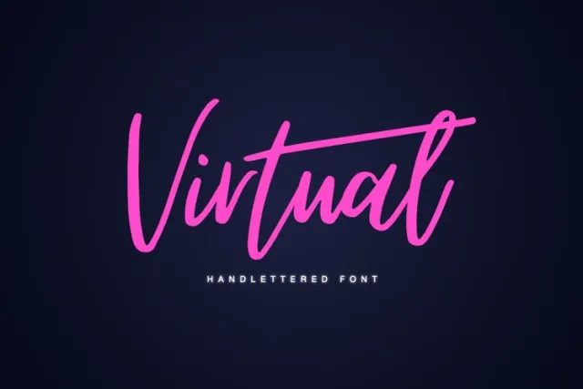
Font Style & Design Analysis
Virtual Font is a script font, and it leans toward a clean, semi-connected handwriting style. The strokes look smooth and slightly rounded, which gives the font family a friendly and accessible mood. It does not try to imitate messy handwriting; instead, it feels controlled, like a careful marker pen on smooth paper.
As far as I could find, the designer is unknown, so I approached it with no brand expectations. That actually helped me judge it only by its typography and performance. I looked closely at the consistency of shapes, how the curves behaved across letters, and whether the font style kept the same voice in different words and phrases.
The letterforms are fairly open, with clear counters and a gentle, flowing rhythm. Spacing is on the safe side, not too tight, which makes short words very readable. In longer lines, the script can feel a bit busy, so I used it mostly for headings, logos, and short quotes. As a script font, it works best when you give it space and avoid very tiny sizes.
Where Can You Use Virtual Font?
I found Virtual Font most comfortable in branding for small lifestyle projects, like cafés, home decor shops, and personal blogs. It gives a human touch without looking messy. When I set it large for logos or main headings, the smooth curves really shine and bring warmth to the visual identity.
In social media graphics, the typeface works nicely for short phrases, product names, or taglines. On mobile screens, it stays readable at medium sizes, but I avoided long sentences in this script style. For body copy or caption text, I always paired it with a simple sans-serif, which calms the layout and lets the script do the expressive work.
Because it is a script font, I would not use it for heavy editorial layouts or data-heavy designs. It also needs careful line spacing to prevent letters from feeling cramped. When used with enough breathing room, though, the font family adds a friendly, modern voice that suits younger audiences, lifestyle brands, and relaxed event materials, like invitations or posters.
Font License
The licensing for Virtual Font may change over time, and terms can differ between personal and commercial use. I always recommend checking the current licence details from the official source before using it in client work, logos, or large production runs. It is safer to confirm than to assume anything.
For me, Virtual Font is a handy, calm script that works well when I need warmth without drama, and I keep it in mind for light, modern branding projects.


Leave a Reply