

About Vivaldi Font
I first reached for Vivaldi Font while designing a wedding invitation set for a client who wanted something very formal, but still romantic. I needed a script that felt classic, not trendy, and that could sit beside clean body text without fighting it. That brief pushed me to give this typeface a proper test.
My first impression was that it carries a very strong sense of ceremony. The sweeping strokes and tall forms give every word a kind of stage presence. I decided to explore it more deeply for Free Fonts Lab, because I kept seeing it used in random places, often poorly, and I wanted to understand where it truly works and where it does not.
Font Style & Design Analysis
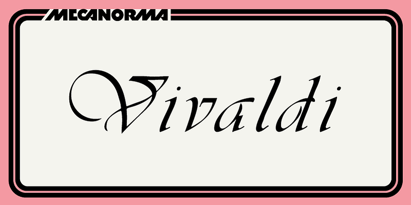
Vivaldi Font is a classic script typeface with strong calligraphic roots. The design leans into high contrast, with thin hairlines and thick main strokes that mimic pointed pen work. The letters feel formal and decorative, almost like something you might see on old certificates or ceremonial documents. It clearly aims for elegance rather than versatility.
The original typeface is usually credited to a traditional foundry, though the exact digital source can vary, so for safety I treat the digital release as designer unknown. Different versions sometimes appear in various font collections, but the core look remains the same. When I test it, I always check which specific font family build I am working with, as quality can differ.
The letterforms are full of flourishes: long entry strokes, curled terminals, and dramatic capitals. This gives the typography a rich rhythm, but it can also crowd the line if tracking is too tight. The spacing feels tuned for larger sizes, not body text. It shines in short names, titles, and single lines, but extended paragraphs quickly become tiring. As a script, it delivers mood and ceremony, yet it demands careful layout and plenty of white space.
Where Can You Use Vivaldi Font?
I have found Vivaldi Font most effective in formal pieces: wedding invitations, certificates, event programmes, and high-end menus. It works nicely for monograms and short headlines where you want a sense of tradition and luxury. At large sizes, the flourishes and contrast become clear and the style feels deliberate, not messy.
At smaller sizes, the fine strokes start to break down, especially in print or on low-resolution screens. For long text, I always switch to a simple serif or sans-serif and let Vivaldi handle just names, key words, or display lines. Pairing it with a calm, neutral typeface helps keep the overall visual identity balanced. Otherwise, the script energy can overwhelm the layout.
For branding, I only use this font when a client directly asks for a very formal, traditional script look. It suits classic beauty brands, heritage hotels, and ceremonial organisations more than modern tech or casual lifestyle projects. Used sparingly, it adds a touch of drama. Used everywhere, it quickly feels old-fashioned and hard to read.
Font License
Licensing for Vivaldi Font can vary depending on where you obtain it, and different versions may have different terms. Before using it in any personal or commercial project, always review the licence details from the official source and make sure the allowed usage matches your needs.
For me, Vivaldi remains a specialised tool: beautiful in the right setting, but only when handled with care and restraint.


Leave a Reply