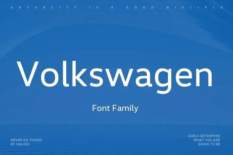
About Volkswagen Font
I first tried the Volkswagen Font while exploring clean options for a modern car-themed poster. I needed a typeface that felt simple, neutral, and honest, without shouting for attention. This font caught my eye because it looked calm and confident, not trendy or forced.
As I tested it in layouts, I liked how steady and balanced it felt. The shapes stayed clear, even with busy images behind the text. I decided to review it for Free Fonts Lab because many designers ask for practical, no-drama fonts for branding, UI, and editorial work. This one fits that need quite well.
Font Style & Design Analysis
This typeface is a sans-serif font, and that choice shapes its whole personality. The design is clean, geometric, and controlled, but it still feels human enough for everyday use. Strokes have even weights, and the counters stay open, which keeps the text easy to scan on screens and in print.
The exact origin of the Volkswagen Font is a bit blurred, and in many online sources the designer is unknown or not clearly credited. It takes visual cues from corporate car branding, especially the calm, engineered look we often see in automotive visual identity systems. Because of that, it carries a clear, industrial mood, even when used outside that niche.
The letterforms are fairly neutral: simple bowls, straightforward terminals, and no flashy quirks. Spacing feels slightly tight by default, which works well for headlines but may need a touch of tracking for longer reading. The rhythm across lines is steady, giving blocks of text a smooth texture. Its strength lies in clarity and restraint, but that also means it is not ideal if you want high character or expressive mood. It works best as a quiet, reliable base rather than a showpiece.
Where Can You Use Volkswagen Font?
The Volkswagen Font works well in brand systems that need trust and simplicity. Corporate decks, product brochures, and clean websites benefit from its even tone. In large sizes, such as posters or hero banners, the shapes look solid and stable, which helps build a confident visual identity without stealing focus from images or logos.
In small sizes, especially on screens, this sans-serif font family stays readable because of its open letterforms and simple structure. I had good results using it for navigation labels, captions, and short paragraphs in UI designs. For longer reading, I prefer to increase line spacing and tracking a bit, so the text breathes more.
For pairing, I usually combine the Volkswagen Font with a warmer serif for body copy, or a more expressive display typeface for headlines. That mix keeps layouts from feeling too cold. It suits audiences who value function and clarity: tech brands, car-related projects, service businesses, or minimalist portfolios. It is less suitable for playful children’s work or artistic posters that rely on strong typographic personality.
Font License
Before you use the Volkswagen Font in any project, check the licence from the original source. Some versions may allow personal use only, while commercial work can require a separate licence or permission. I always recommend reading the full terms carefully, especially for client projects and brand identities.
For me, this font is a steady, down-to-earth choice when I want typography to support the design quietly and let the content speak first.


Leave a Reply