
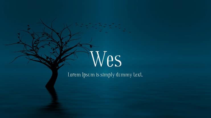

About Wes Font
I came across Wes Font while I was comparing serif options for a small editorial project. I needed a typeface that felt calm, clear, and a bit literary, without looking old or heavy. Its first impression was gentle, and that made me stop and look more closely at its shapes.
I decided to test it in a sample magazine layout for Free Fonts Lab, mixing short articles, quotes, and captions. I wanted to see how this font family behaved in long reading text and also in slightly larger headings. Wes Font looked promising enough to deserve a careful, real-world trial.
Font Style & Design Analysis
Wes Font is a serif typeface with a soft, bookish voice. The strokes feel balanced and steady, with serifs that are noticeable but not sharp or dramatic. It leans more toward a modern reading style than a classical, engraved look. The overall impression is clean, tidy, and quietly confident.
The designer is designer unknown, at least from the sources I could check during my tests. That lack of clear credit does not change how the typeface works in practice, but it does mean we have to judge it mainly by what we see on screen and in print, not by a known design story.
The letterforms sit on a comfortable rhythm, with enough inner space to breathe, especially in lowercase. Spacing feels slightly open, which helps at small sizes and in longer text blocks. The caps are structured but not stiff, so headings do not shout. As a serif, its main strength is calm reading; its limit appears when you push it into bold, loud display work, where it can look a bit too polite.
Where Can You Use Wes Font?
I see Wes Font working well in editorial design, book interiors, and blog articles where reading comfort matters. In long paragraphs at medium sizes, the typography feels smooth and steady. It supports a relaxed visual identity, which suits personal brands, journals, and knowledge-based content.
At larger sizes, like section titles or pull quotes, the font style stays modest but clear. It will not give you a dramatic poster look, but it does offer a trustworthy, balanced voice. For pairing, I found it works nicely with a clean sans-serif for menus, UI labels, or small captions, while Wes Font handles the main reading text.
In smaller sizes, such as footnotes or legal text, the slightly open spacing and simple letterforms keep things readable. I would use it for reports, presentations, and simple brand guidelines aimed at thoughtful, detail-aware audiences. It is less suited to playful children’s work or bold youth culture graphics, where you might want something more expressive.
Font License
Licensing for Wes Font can vary by source, so I do not assume anything about personal or commercial rights. Before you use it in client work, products, or large projects, always check the current licence details from the official distributor. I treat it carefully until I read those terms in full.
My honest takeaway as Ayan Farabi: Wes Font is a quiet, reliable serif that I reach for when I want calm reading and a gentle, book-like tone.


Leave a Reply