
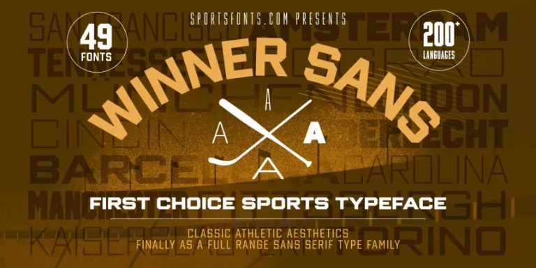

About Winner Sans Font
I came across Winner Sans Font while working on a clean brand refresh for a tech client. I needed a modern typeface that looked friendly, not cold, and still felt strong in bold weights. This font kept showing up in my tests, so I decided to explore it more deeply.
What pulled me in first was its calm, even texture across a page. Nothing screamed for attention, yet the text stayed clear and steady. I tested it in headings, body text, and UI labels for a mock product page for Free Fonts Lab. It handled each role with a different kind of quiet confidence.
Font Style & Design Analysis
Winner Sans Font is a sans-serif typeface with a clean, contemporary voice. The shapes feel balanced and direct, without being harsh. Strokes look even, curves feel open, and the design leans slightly towards a geometric look, but with enough softness to keep it human and approachable in real layouts.
The exact designer information is not clearly documented, so I have to treat it as designer unknown. That said, the font family feels carefully planned. The weights progress in a sensible way, and the overall typography system suggests a steady design hand, even if the name behind it stays out of view.
The letterforms show wide counters and simple terminals, which help legibility at many sizes. Spacing feels generous, especially in the lighter weights, giving text room to breathe. In dense paragraphs, the rhythm stays calm, not jumpy. It shines in user interfaces and branding, but it may feel a bit too neutral if you need a very strong, expressive voice. As a modern sans-serif, it works best when clarity is more important than strong personality.
Where Can You Use Winner Sans Font?
I see Winner Sans Font working very well in digital products, tech brands, and clean editorial layouts. In large sizes, the shapes stay crisp and confident, which makes it a good heading choice for landing pages and slide decks. It looks especially solid in bold and semi-bold for short, clear messages.
In smaller sizes, the open counters and simple forms keep text easy to read. That makes it a strong option for UI labels, menus, and app interfaces. For body copy, it works well on screen, though I like to give it slightly more line spacing than default to keep the texture airy and comfortable.
For pairings, I like using this typeface as the main sans-serif workhorse, then adding a contrasting serif for long-form reading or accent pull quotes. It also pairs nicely with a more expressive display font for logos, while it handles navigation, buttons, and system text. If your visual identity needs something neutral, structured, and reliable, this font family can quietly support many different layouts and audiences.
Font License
The licence for Winner Sans Font can change depending on where you download it. Some sources may allow personal use only, while commercial projects might need a paid or special licence. I always recommend checking the official licence details at the source before using it in client work or large commercial branding.
After testing it in real layouts, my honest take is simple: if you need a calm, clear sans-serif that stays out of the way and lets the design speak, this font is worth a careful look and some hands-on testing in your own projects.


Leave a Reply