

About Wolf Font
I came across Wolf Font while I was searching for a bold display face for a poster project. I needed something loud, but not messy. The type on the page had to feel strong enough to stand alone, without heavy graphics around it.
What pulled me in was its sharp energy and clear shapes. It looked wild, yet still readable. I decided to test it in a few layouts for Free Fonts Lab, just to see how far I could push it. That trial turned into a deeper look at how this typeface behaves in real design work.
Font Style & Design Analysis
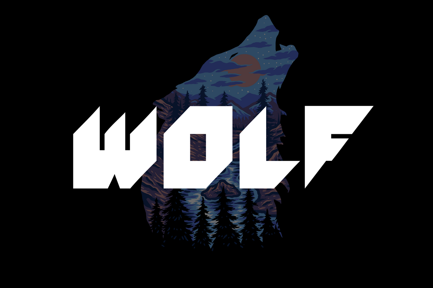
Wolf Font sits firmly in the display category, and it shows that from the first word you set. The letters feel heavy and confident, with strong lines and tight forms. It is clearly designed to grab attention, not to disappear into long blocks of text.
The exact creator of this font is designer unknown, which can happen with many free display fonts shared online. Even so, the work behind it feels deliberate. The shapes suggest someone who understands visual impact and how bold typography can carry a layout on its own.
The letterforms have a compact build, with short strokes and minimal curves. This gives the font a tough, almost aggressive mood. Spacing is quite tight, so words form dense, dark clusters on the page. That weight works well for short headlines, logos, and labels, but it can feel heavy in longer lines. As a display font family, its strength lies in big sizes and short phrases, not body copy or small captions.
Where Can You Use Wolf Font?
In my own tests, Wolf Font worked best in poster headlines and cover titles. At large sizes, the strong shapes read clearly from a distance. The bold texture helps it cut through busy backgrounds, which is useful for music events, gaming graphics, or streetwear themes.
On screens, it holds up well for banners, thumbnails, and social media graphics. Set it big, give it space, and it does the job. At smaller sizes, though, the tight spacing and heavy forms start to blur. I would not use it for long quotes, UI labels, or anything that must be read quickly in small text.
For pairing, I like matching this display font with a clean sans-serif or a simple serif body typeface. Let Wolf Font handle the title, then keep the supporting text calm and neutral. This contrast helps the visual identity feel balanced. It speaks loud where needed, then steps back by not trying to do every role at once.
Font License
Before using Wolf Font in client or commercial projects, I always recommend checking the current licence details from the official source. Terms for personal and commercial use can change, and free use is not always guaranteed. Taking a moment to confirm rights will protect both you and your client.
My honest take as Ayan Farabi: use this typeface when you need a bold, punchy headline that owns the page, but pair it with something calmer and avoid forcing it into roles it was never designed to fill.


Leave a Reply