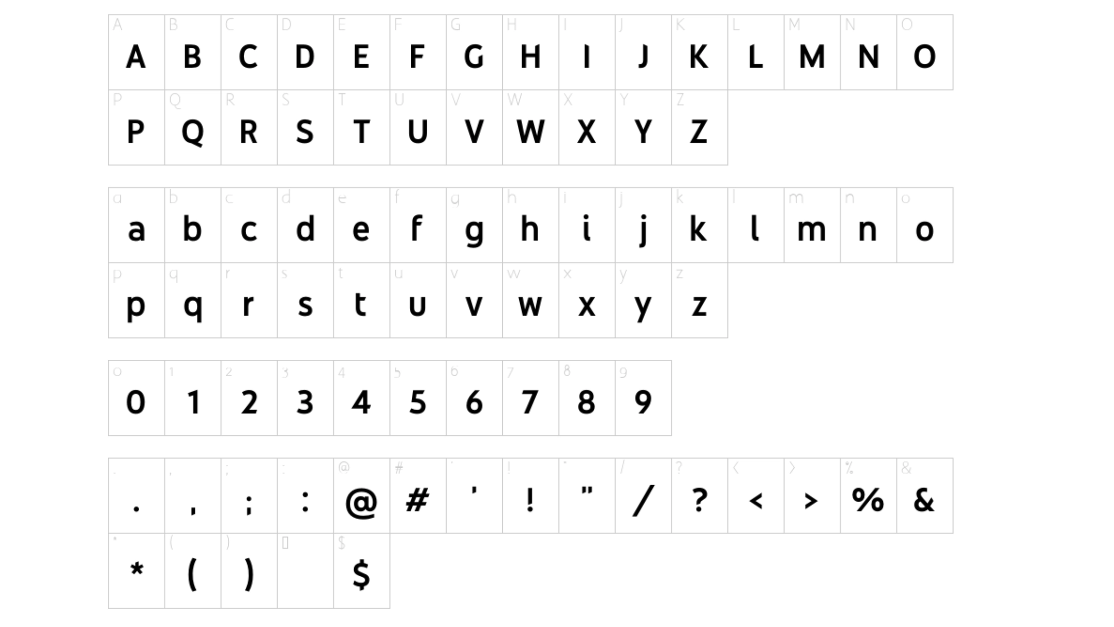
About Youtube Sans Font
I first tried the Youtube Sans Font while working on a video channel rebrand for a tech client. They wanted something clean, modern, and friendly, without feeling too playful or too strict. The brief pointed me towards a simple geometric style that could handle both bold headlines and tiny interface text.
During testing, I compared several modern typefaces side by side and this one kept catching my eye. Its shapes felt balanced and confident, yet still soft enough for everyday content. I decided to explore it deeper for Free Fonts Lab, focusing on how it behaves in real layouts rather than just judging a pretty specimen sheet.
Font Style & Design Analysis
Youtube Sans Font is a sans-serif typeface with a clear, modern voice. The structure leans towards geometric shapes, but there is enough soft rounding to keep it from feeling cold. Strokes feel even and stable, which gives the font family a calm and controlled tone that fits many digital interfaces.
The original YouTube brand typeface was developed by a professional design team, though the exact creator for this specific shared version is often unclear, so I treat it as designer unknown. That uncertainty makes it important to view it more as an inspired font style than as an official brand asset, especially when planning serious identity work.
The letterforms show a clear rhythm, with open counters and generous internal space. This helps readability, especially on screens. The spacing feels slightly tight at larger sizes, so I sometimes add a touch of tracking for headlines. In small text, it stays legible, but extended reading can feel a bit mechanical. It shines in UI labels, captions, and short copy, less so in long essays.
Where Can You Use Youtube Sans Font?
In my tests, Youtube Sans Font worked best for digital products, video graphics, and social media layouts. At large sizes, it delivers bold, simple headlines that feel direct and honest. Its sans-serif nature makes it ideal for clean presentations, app interfaces, and YouTube thumbnail text where clarity matters more than personality.
At smaller sizes, such as captions, menus, or buttons, the typography stays readable and steady. I would avoid using it for dense paragraphs in print, as the uniform strokes can feel tiring over many lines. For web UI, though, this typeface balances clarity and friendliness quite well, especially against light backgrounds.
When pairing, I usually combine Youtube Sans Font with a contrasting serif for body text, which adds warmth and hierarchy. For more minimal layouts, using two weights of this same font family can also work: a bold weight for headings and a regular for short body copy. It suits tech brands, content platforms, and creators who want a modern, neutral visual identity.
Font License
The licensing for Youtube Sans Font can vary, and the shared versions online may not match the original brand licence. I never assume it is free for commercial work. Before using it in client projects or large campaigns, I always check the official source and review the current licence terms carefully.
My personal takeaway as Ayan Farabi: I use this font when I need a clear, modern, video-friendly look, but only after confirming the licence and checking that its somewhat neutral voice matches the brand story.


Leave a Reply