

About Yugioh Font
I first reached for Yugioh Font while working on a gaming logo that needed clear fantasy energy without looking childish. The client wanted something bold, sharp, and slightly mystical, but still easy to read at a glance. This typeface felt close to that brief, so I decided to give it a real test.
During that project, I tried the font in title screens, badges, and simple icons. I also mocked it up for card backs and streaming overlays to see how far it could stretch. I shared early tests with the client and later wrote down notes for Free Fonts Lab, because the behaviour of this font was more specific than I expected.
Font Style & Design Analysis
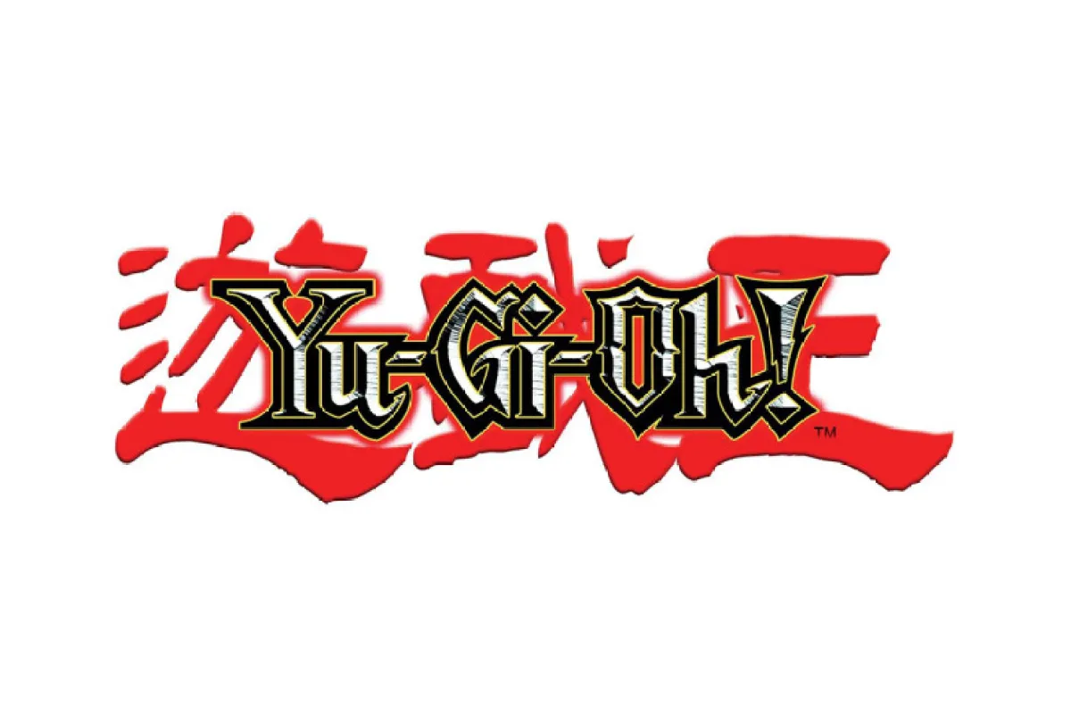
Yugioh Font is a logo font at its core, and every choice in the design points in that direction. The letterforms feel inspired by fantasy anime branding, with an angular profile and strong edges. Strokes are thick, contrast is pushed, and the shapes hold a dramatic, almost carved look that works well in bold titles.
The creator of this font is designer unknown, which makes detailed background context tricky. Still, the intent feels clear: a compact, heroic display style for game or card-based branding. You can see echoes of trading card culture and early 2000s title design, but it stays just far enough from being a direct copy of any single logo.
The letterforms have tight spacing and a dense rhythm, which helps the font punch through in short words. Diagonal strokes and pointed terminals add movement, while the heavy weight gives each character a solid block presence. This gives strong mood but also adds limits: long texts feel cramped, and small sizes lose clarity. In short bursts, though, the font style is confident and memorable.
Where Can You Use Yugioh Font?
I see Yugioh Font working best as a focused logo font for gaming, anime, and fantasy projects. It suits card game identities, stream branding, fan event posters, and digital badges. On a large banner or thumbnail, the dramatic shapes stand out and create a clear visual identity that fans of that genre recognise quickly.
At big sizes, the typeface keeps its crisp angles and bold silhouette. You can push it on title screens, merchandise marks, and social headers without losing impact. At smaller sizes, such as UI labels or body text, the heavy weight and tight spacing start to fight legibility. I usually keep it for headlines of three to six words, never for long paragraphs.
For pairings, I like matching this font family with a clean sans-serif that stays quiet in the background. Use the logo font for the main wordmark or key phrase, then bring in a neutral partner for menus, captions, and long copy. When you keep contrast high in both size and style, the Yugioh look feels strong instead of noisy.
Font License
The licensing for Yugioh Font can vary between sources, so I never assume it is free for every use. Before using it in client work or commercial branding, always read the official licence terms carefully and check for any limits on logo, print, or digital use.
For me, this font shines when treated like a special tool: strong, specific, and best used with care in the right logo and title work.


Leave a Reply